When I was 14, I was sketching an old opera house with my art tutor. That was the moment I realized a space can hold emotion the way a sponge holds water. I still carry that with me.
But if you are opening your first cafe, salon, bakery, or retail shop, emotion alone will not carry the business. Your space has to pull people in. It has to support the operation. It has to make daily life easier for you, your staff, and your customers.
I have spent more than two decades working across Guangdong, Shanghai, Singapore, and Canada, much of that time in retail, hospitality, and commercial interiors. The lesson has stayed the same for me. Good design is the perfect solution to a problem.
And physical space still matters. A lot. Even with online growth, e-commerce was still only 16.9% of total retail sales in the U.S. in early 2026. People still buy in real places. So if you are putting your savings into a first location, the design has to work very hard for you.
This is the step-by-step process I want beginners to understand.
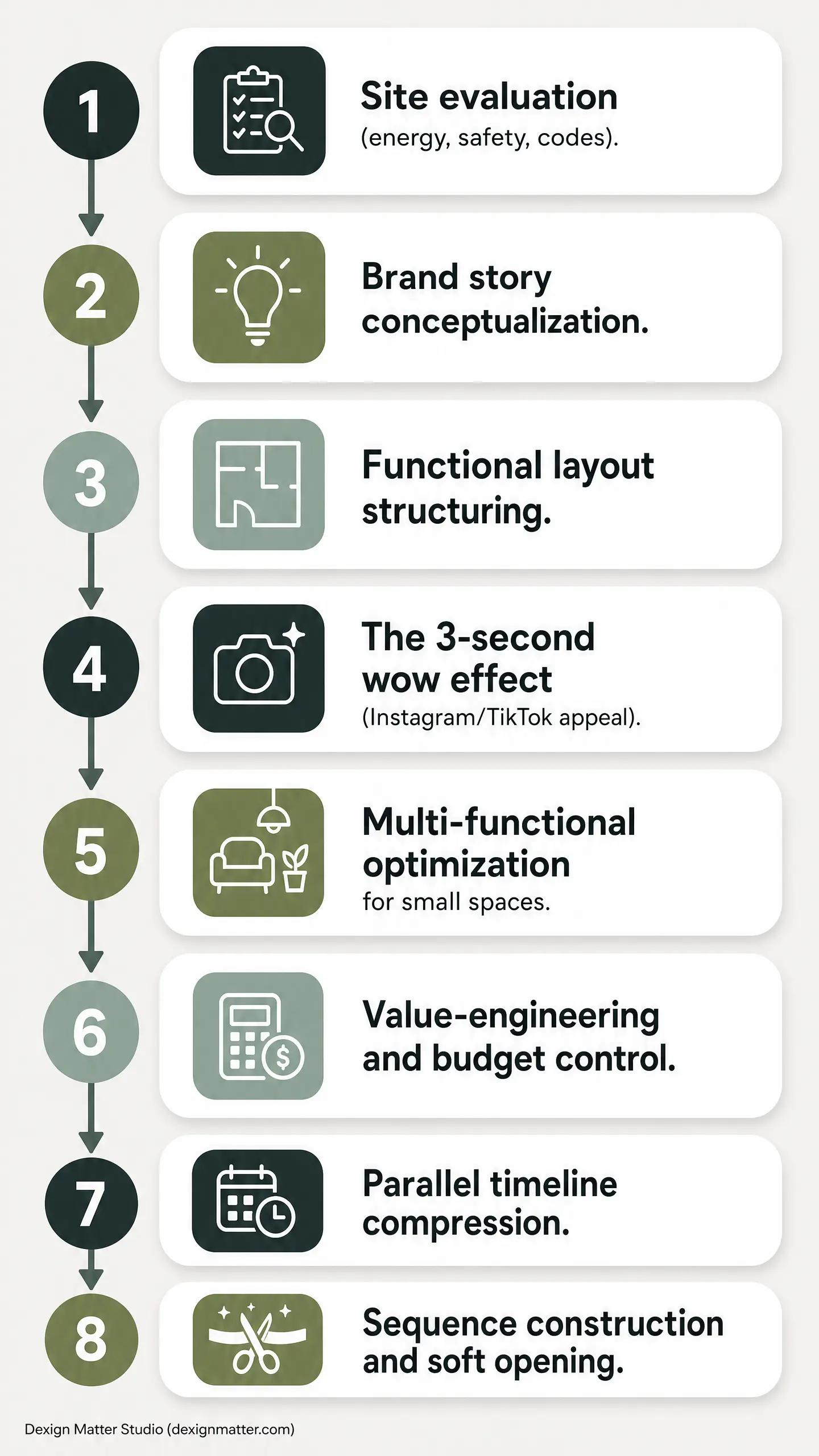
Step 1: Check the Space Before You Sign the Lease
This is the first thing I tell founders. Do not sign the lease just because the storefront looks nice. Bring a designer or architect to the site before you commit.
I want to know if the space can truly support your business. I check the electrical panel, the water supply and drainage, the floor condition, the ceiling height, and the mechanical reality above the ceiling. If you are opening a bakery, cafe, salon, spa, or restaurant, these items are not minor details. They shape your budget, your layout, and your timeline.
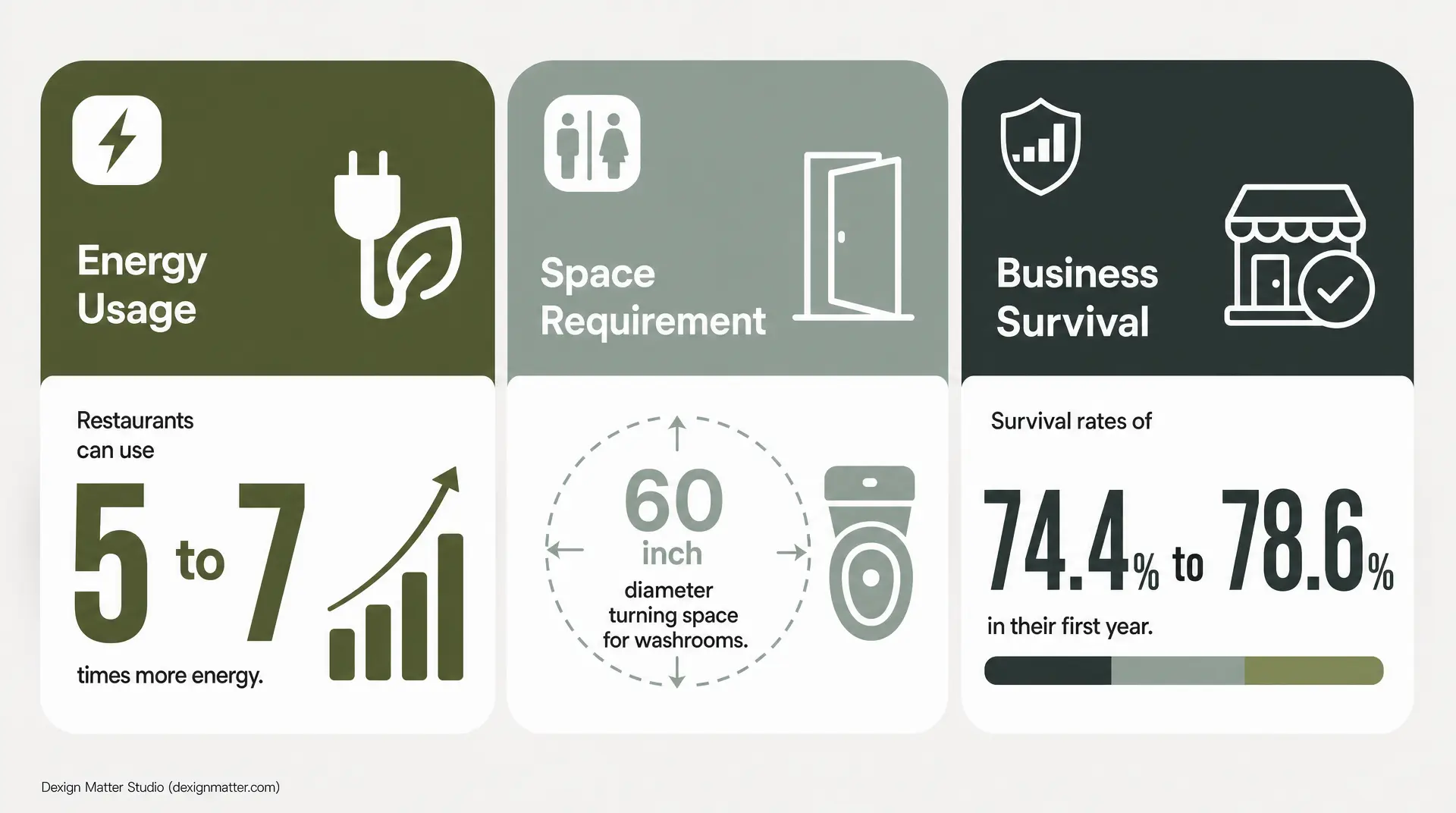
Power is a big one. Restaurants can use 5 to 7 times more energy per square foot than other commercial buildings. If the electrical capacity is weak, you will feel it immediately when you start planning equipment.
Safety matters too. In 2023, U.S. nonresidential buildings had 7,400 electrical-malfunction fires. That is why I never treat panel capacity, wiring, and lighting systems casually. I want those questions answered early.
Washrooms can change everything as well. In small commercial spaces, one accessible washroom can reshape the full plan. A common benchmark is a 60-inch diameter turning space. If your leased unit cannot support that properly, you need to know before you are locked in.
This early review is risk control. It is not extra spending. New establishments in the U.S. had survival rates of 74.4% to 78.6% in their first year depending on region. That means plenty do not make it. If you are a first-time founder, you cannot afford avoidable mistakes before construction even begins.
Step 2: Build the Story Before You Build the Space
Once I know the site can work, I move to concept. This is where many beginners want to jump straight to Pinterest boards. I understand that. But saved images are not a brand.
Every branding has their story. Every branding has to have their own character. If you follow a one-size-fits-all trend, your space gets lost very fast.
This is why the conceptual development stage is so important to me. It is where I unlock the spirit of the project. I want to know who your customer is, what they should feel in the first few seconds, and what memory should stay with them after they leave. Warm? Playful? Soft luxury? Clean and sharp? That answer drives everything after.
Branding, story, and interior design always tie together. If they do not, the project feels disconnected.
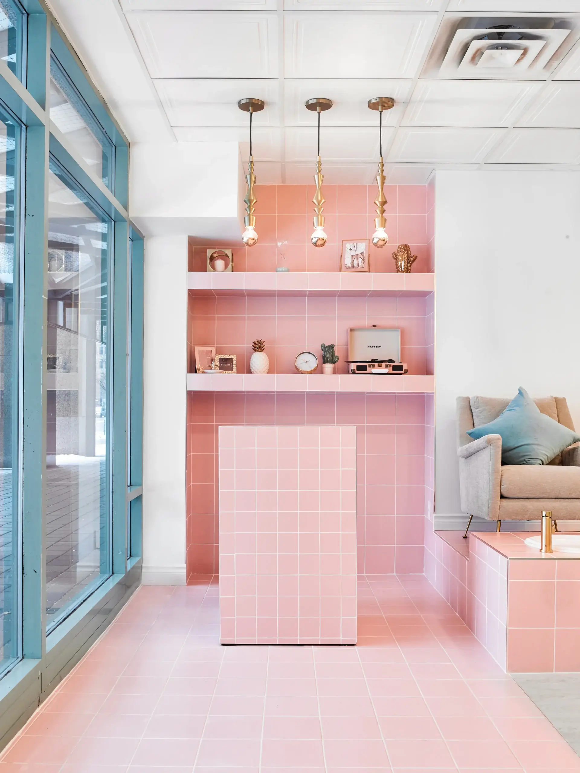
At The Cube Nail Lab, the owner was opening her first business. We built the identity from the concept itself. The name, the branding, the tiled grid, the pink palette, and the reception counter all came from one clear idea. That is why the space felt complete. It had its own voice.
So before you talk too much about marble, tile, or paint color, ask a more important question. What is the character of your brand? If you do not know that still, your designer should help you find it.
Step 3: Finalize the Layout First
For sure, the look matters. But I always start with function.
I tell clients this all the time: the structure is like the human body. You have to have a good structure and then you put on your coat. In commercial design, the layout is that structure.
The whole planning and layout is very important. You need connection in some areas and separation in others. You need customer flow, staff flow, storage, equipment, and code requirements all working together.
I ask very basic questions. Where do customers enter? What do they see first? Where do they order? Where do they wait? Where do they pick up? How do staff move when the space gets busy? Where do the messy functions happen so the front still feels clean?
Commercial design is holistic. Codes, systems, furniture, traffic patterns, storage, and branding all sit in the same conversation. If one part is ignored, the whole thing becomes harder to use.
This affects staff safety too. In U.S. food services and drinking places, there were 2.4 cases per 100 workers in 2023 for nonfatal injury and illness. Tight corners, poor storage, and bad back-of-house circulation create stress every day. Good design should reduce that stress.
Customers feel the difference as well. A study of fast-food restaurants found that physical environment quality was tied to satisfaction and revisit intention. I believe that completely. People may not describe it in design language, but they feel it in their body when a space flows well.
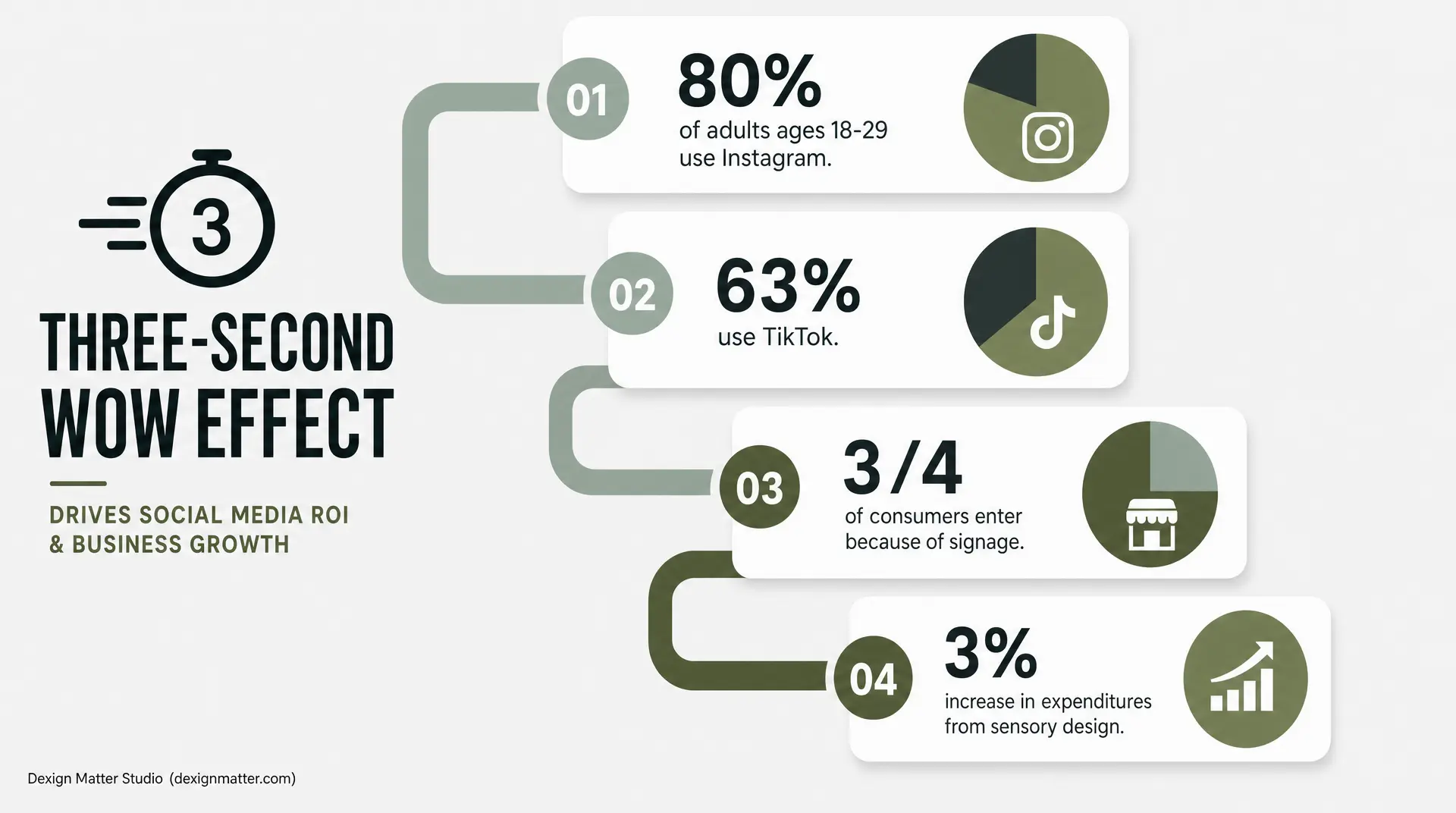
Step 4: Create the Three-Second Wow Effect
Commercial interiors move differently from residential ones. In a home, I think about long-term comfort and calm. In a business, I think about first impression.
You need a three-second wow effect.
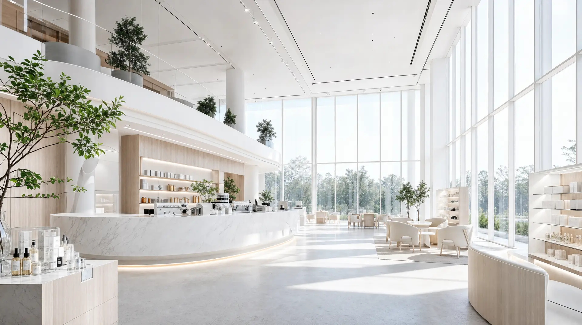
That does not mean everything has to be loud. It means one or two moments need to work very hard. I usually advise founders to put about 10 to 20% of the budget into the first-impression zone. That may be the reception, cashier, logo wall, feature wall, display counter, or a photogenic seating area.
This is real marketing value. Pew Research Center found that 80% of adults ages 18 to 29 use Instagram and 63% use TikTok. If your customer is young and visual, your interior is part of your advertising.
Storefront identity matters too. A report found about three-fourths of consumers had entered a store or referred a friend because the signage made the business stand out. So yes, I care about the front. A lot.
I also think about light. If I can place the photo moment near a window or in the cleanest entry view, even better. People need a good backdrop. They need a reason to stop and take a photo.
And I never think only visually. My design approach is always about a multi-layered, stimulating sensory experience. I love exploring the juxtaposition of materials, colors, forms and patterns. Research has linked retail environments with higher pleasure and satisfaction when sensory cues are handled well. Pleasant ambient scent has also shown an average 3% increase in customer expenditures. Material is a game player. Lighting is a game player. Mood is a game player.
Step 5: Make Small Spaces Work Harder
This is where beginners usually feel stuck. They have a tiny footprint, but the business still needs production, storage, service, display, waiting, staff movement, and brand impact. I love this puzzle. But it has to be solved very carefully.
In tight cafes and bakeries, I like the flow to read clearly. The cash register should face the entrance. The display should sit right beside it so customers can look while they order. Then I create a separate pickup zone. That sequence helps customers understand the space right away, and it helps staff move faster too.
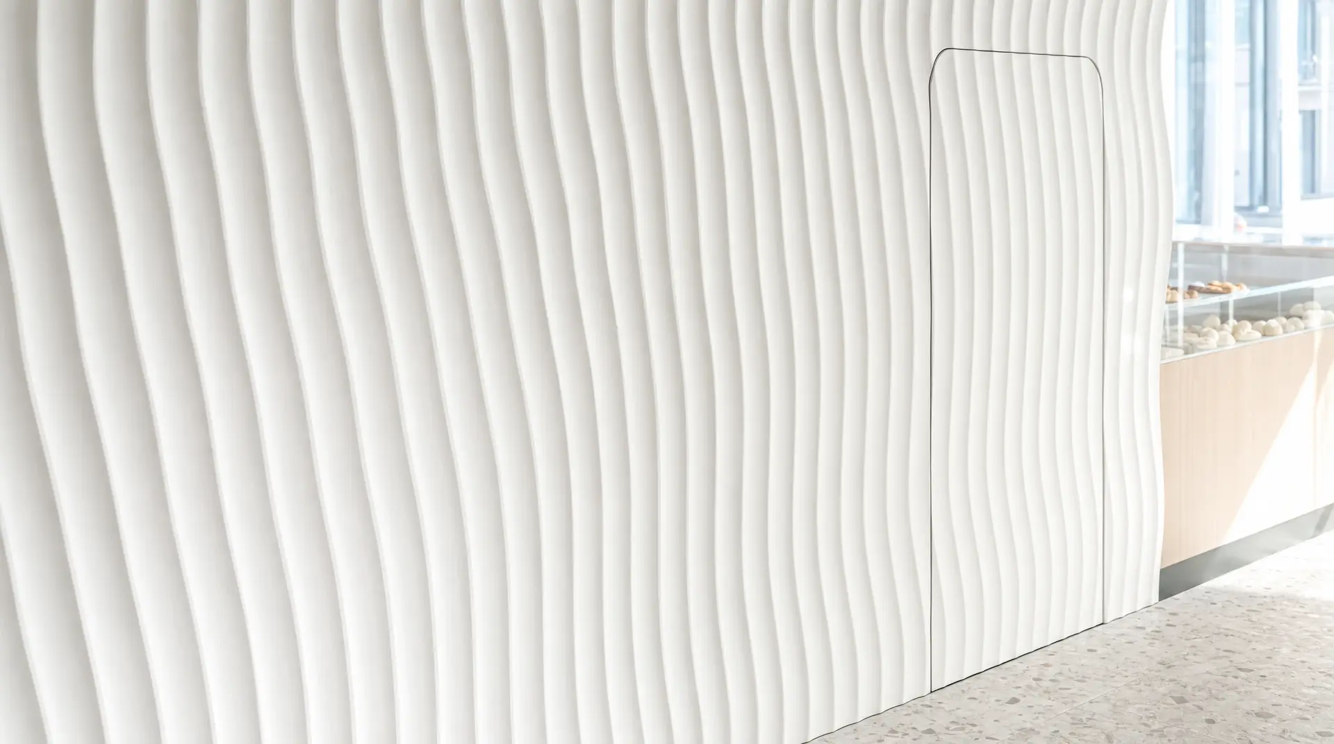
Cuckoo Cakery: Hide the Storage Inside the Concept

Cuckoo Cakery was only 700 square feet. It still had to hold cake production, sales, seating, display, and storage. So I thought about storage from the beginning, not at the end.
We designed a wavy wall inspired by icing knife patterns. That became the identity of the space. But I also used that same feature wall to hide storage behind the millwork. When customers looked at the store, they saw one continuous design move. They did not see the working parts tucked behind it.
The original feature wall product from the U.S. was too expensive for the budget. So I kept the concept and changed the method. I redrew the wave and had it CNC-cut locally. That cut the cost by nearly half while keeping the same look. This is how I value-engineer. I do not throw away the idea. I protect the design and change the fabrication strategy.
New Century Head Spa: Make One Area Do Two Jobs
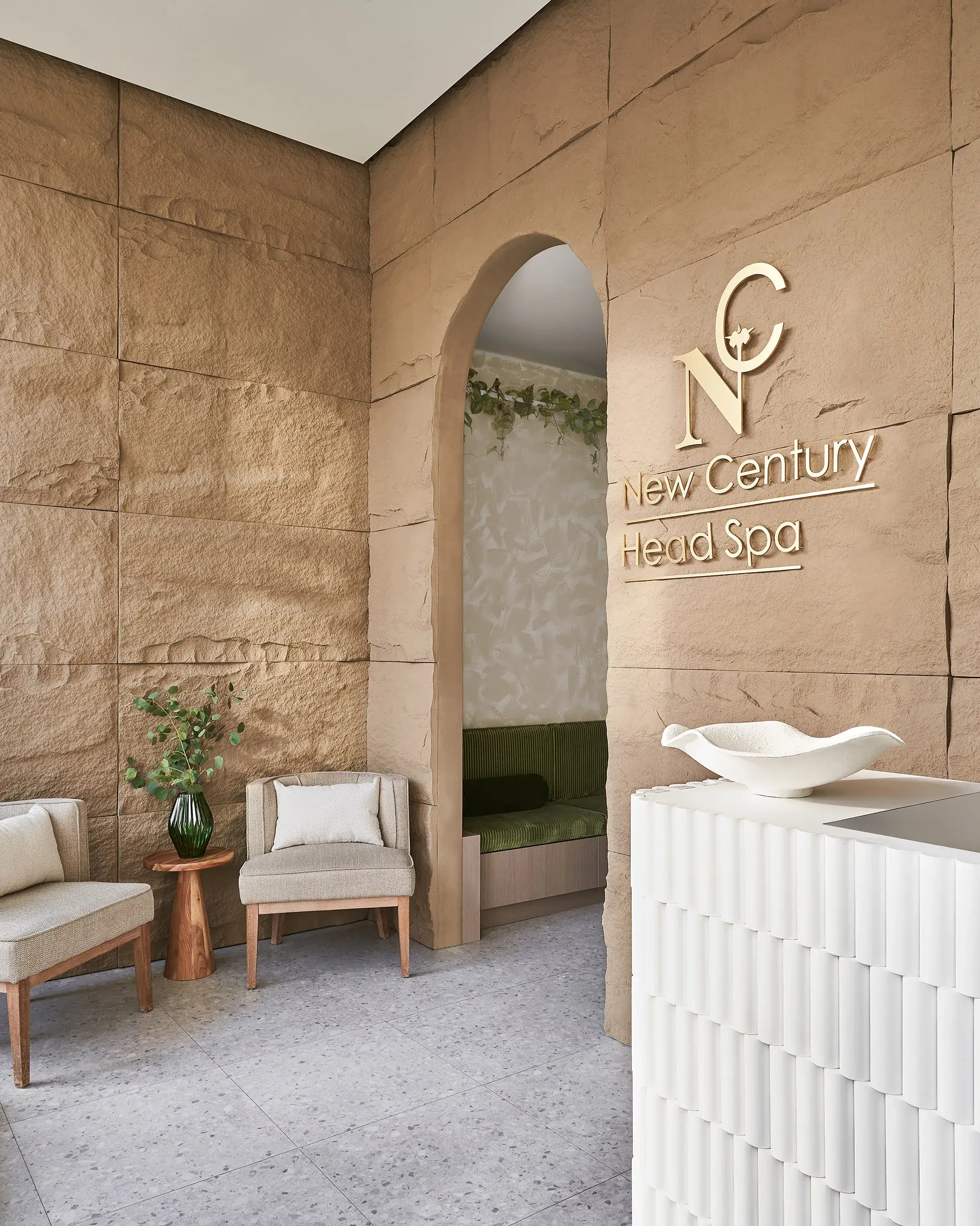
New Century Head Spa had a different problem. The footprint was only 900 square feet, but the client needed treatment rooms, shampoo stations, reception, waiting, a foot-spa area, staff functions, and an accessible washroom.
I used sliding doors so one treatment room could become two, or open up for a larger group. I designed the long green velvet bench to work as both the waiting area and the foot-soaking area before treatment. Then I placed the hair-drying zone at the back. That way, once clients finished treatment, they moved out of the room and freed it up for the next round.
That one decision improved turnaround. We never compromise the function. In small commercial spaces, one move often has to do two or three jobs.
Step 6: Know Where You Can Save, and Where You Must Spend
This is the budget conversation I have all the time with first-time founders. They are excited, but they are also nervous. That is normal.
My job is to show you where you can save, where you must spend. I protect the layout first. Then I protect electrical, plumbing, code-related work, durable working surfaces, and the first-impression area. These pieces affect the business every day.
Then I value-engineer the quieter parts of the project. Maybe the original Calacatta stone becomes quartz. Maybe the quartz becomes high-quality laminate. Maybe the marble becomes marble-look porcelain. The look stays strong, but the cost comes down.
The material itself also has to be functional. If it stains too easily, chips too easily, or cannot handle daily use, it is the wrong choice no matter how pretty it looks.
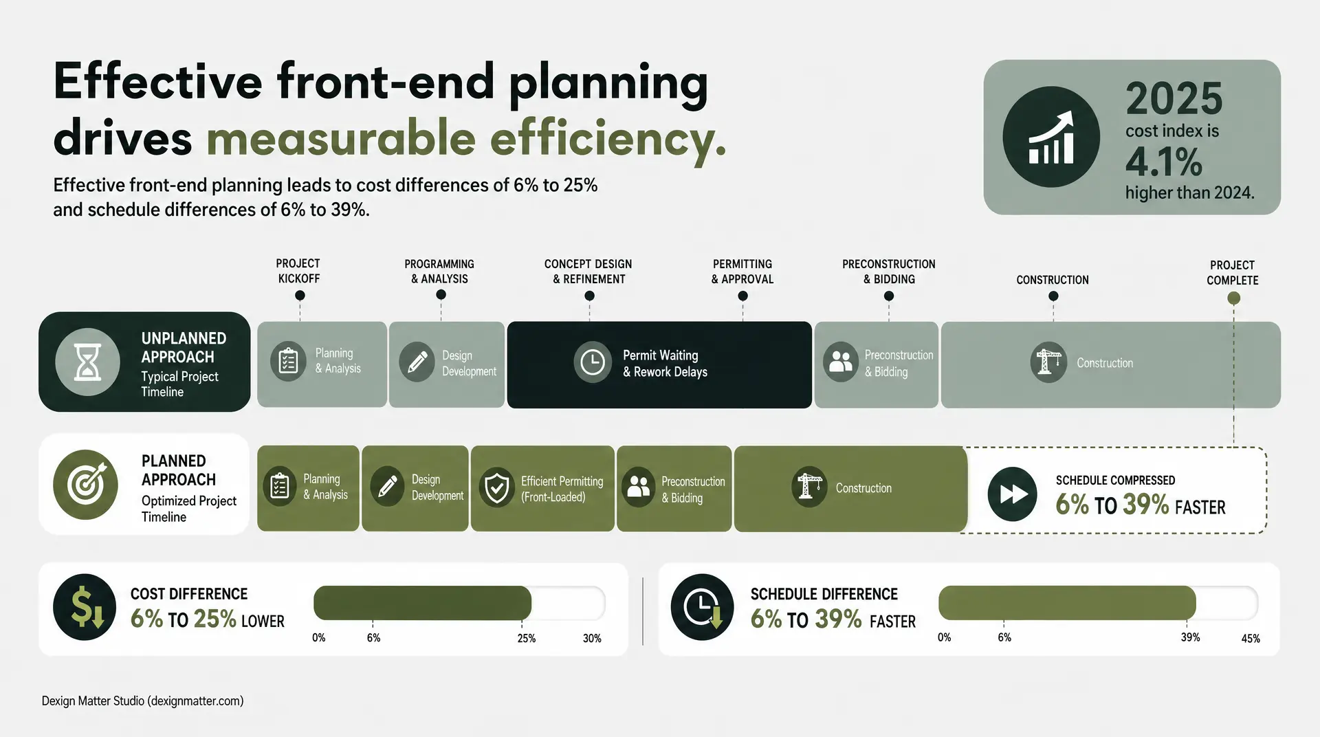
Late changes are expensive now. Turner Construction’s 2025 average cost index was 4.1% higher than 2024. So I push clients to make the big decisions early and stay disciplined.
I also help founders phase their spending. Some items are must-do right now. Some items can wait for phase two if cash flow is tight. And when I talk to startup clients, I often go beyond design and talk about financing and budget logic too, because the space is part of the business model.
I also source smart. Lighting usually needs to come from local suppliers so it can meet code and inspection requirements. Tile, furniture, and some loose pieces can come from overseas if the schedule is planned properly. Spend on what supports the business long term. ENERGY STAR says certified commercial refrigerators and freezers are 30% more energy efficient on average. That kind of decision matters more than overspending on a finish no customer will notice.
Step 7: Compress the Timeline Without Cutting Corners
A lot of beginners think the permit and drawing phase has to drag forever. I do not like dead time. Rent is already running.
Once the final layout is confirmed, I pass that layout to the engineer. While the engineer is working and the permit is with the city, my team is already developing the 3D renderings, finish selections, and construction package. So the waiting time is still productive time.
At Dexign Matter Studio, we built our own in-house drawing system because I wanted more control and more speed. It helps us reduce drawing time sharply while still giving the contractor the detail they need to build properly.
There is a reason I push front-end planning so hard. Construction Industry Institute research linked effective front-end planning to cost differences of 6% to 25% and schedule differences of 6% to 39%. That is a huge swing for a first location.
And I have to say this clearly: nice AI renderings do not solve real construction problems. AI does not know your exact ceiling height, window height, or where the bulkhead has to drop to hide HVAC and piping. It does not know what surprise rough-ins are sitting behind the wall.
Problem solving is part of the job. If demolition reveals a support beam, I can hide it in millwork or make it part of the design so it looks intentional. That is real commercial interior design.
Step 8: Build in the Right Sequence, Then Soft Open
Construction also needs order. If materials arrive at the wrong time, the site gets messy and the schedule slips.
I keep the sequence simple. Rough-ins come first. Then the hard finishes go in. After that, drywall and paint finish. Millwork follows. Lighting comes after the millwork is ready. Loose furniture and accessories come last. Furniture does not need to sit on site while dust and construction traffic are still happening.
I also like working with construction teams that use in-house workers. It gives tighter control over quality and schedule, which matters a lot when the opening date is close.
Then, before the grand opening, I strongly believe in a soft opening at about 90 to 95% completion. For restaurants and cafes, this gives staff time to learn the flow and start working like a team. For retail, it gives time to set merchandise, test displays, and prepare seasonal areas for moments like Mother’s Day or Valentine’s Day.
That stage is very valuable. It catches small problems before they become public problems.
Final Thoughts
If you are opening your first commercial space, keep the process clear. Check the site before the lease. Build the story before the finishes. Lock the layout early. Create the three-second wow effect. Hide the storage. Spend smart. Move permits and drawings in parallel. Then test the space before the grand opening.
I love curating spaces, dressing up walls and adding finishes. But at the end of the day, good commercial design is about solving the problem well. When the layout works, the brand is clear, and the customer feels connected to the space, you can feel it right away.
That is good design to me. And when it is done right, every space should sing and dance.
Frequently Asked Questions
Can I skip an accessible washroom if my leased commercial space is tiny?
No, you cannot ignore code requirements. The 2010 ADA Standards legally require accessible washrooms to include a 60-inch diameter turning space. Even in tiny footprints, this dictates your layout. This is why I always check the plumbing reality before you sign a lease.
Does ambient music and scent actually increase retail sales?
Yes, completely. I always design for a multi-layered sensory experience, not just visuals. Research shows that a pleasant, familiar ambient scent can drive an average 3% to 10% increase in customer expenditures. Lighting, mood, and smell are serious game players for your bottom line.
Should I hire a general contractor before finalizing my interior design?
I do not recommend this. You must finalize the layout and design scope first. Proper front-end planning drives cost differences of 6% to 25% and prevents expensive late changes. Lock your concept and drawings early, then bring in the contractor to build the vision accurately.
Should I buy cheaper residential equipment to save my startup budget?
No. You must protect the infrastructure that runs your business daily. I advise clients to invest here. Certified commercial refrigerators and freezers are 30% more energy efficient. Spend smartly on durable, commercial-grade infrastructure first, and value-engineer your decorative finishes instead.
Can I use residential furniture to save money in my new cafe?
I never advise this. Residential pieces cannot handle daily commercial traffic. If a chair chips, stains, or breaks easily, it is the wrong choice, no matter how pretty it looks. I always tell founders to spend on durable, commercial-grade pieces that protect your business long term.