If you are opening your first bakery, the pressure is real. You want a space that looks beautiful. You want customers to remember it. You want the workflow to make sense. And you want all of that without blowing your startup budget.
I learned very early that a space can hold emotion. A bakery proves that every day. People do not walk in only for sugar. They walk in for comfort, routine, reward, and a small moment of joy.
That is why bakery design matters so much. It has to carry feeling, but it also has to work hard. Behind the pretty counter, there is production, storage, payment, pickup, plumbing, code, and staff flow. If those things are not resolved, the bakery will feel stressful very fast.
I am Zoe Lee, founder of Dexign Matter Studio in Toronto. I have spent more than two decades designing commercial, hospitality, and residential spaces across Guangdong, Shanghai, Singapore, and Canada. My studio has completed more than 150 interior projects across Canada, and we have earned over 30 international design awards. Still, my design philosophy stays very simple: a good design is the perfect solution to a problem.
For a bakery, that problem is clear. You need a space that gives a three-second wow effect, supports daily operations, and helps build your brand from day one.
Why Bakery Design Matters Right Now
This is a strong moment for local bakeries in Canada. Interac found that 64% of Canadians say small, affordable treats help lift their mood, 59% feel even better when the purchase supports a local business, and 30% reported spending more on baked goods from local bakeries. On top of that, 78% of Canadians shifted at least one monthly purchase from a big-box chain to a local business.
That tells me something important. Customers are already open to local brands. They want the treat. They want the experience. They want to feel good about where they spend.
Small businesses also saw 15 million more Interac debit transactions between April and July 2025 than the year before. So yes, the demand is there. Your space has to be ready to meet it.
A bakery is one of the clearest examples of where branding and interior design have to work together. The shop front is not just a shell. It is your first ad. It is your first sales tool. It is your first chance to tell people who you are.
Start with the Footprint, Not the Finish
Divide the Working Area and the Customer Area
When I walk into a bakery shell, I do not start with wallpaper or pendant lights. First, I look at the footprint. Then I divide the space into two worlds: the working area and the customer area.
You have to create the flow. Where is the cash? Where is the working area? Where is the pickup area? If that sequence is weak, the whole bakery feels messy.
Bakery guides often recommend using 60 to 70% of the floor area for production, with about 10 to 15% for storage. I think those numbers are a helpful starting point. I do not follow them blindly, but they remind owners of one big truth: the back of house usually needs more room than you think.
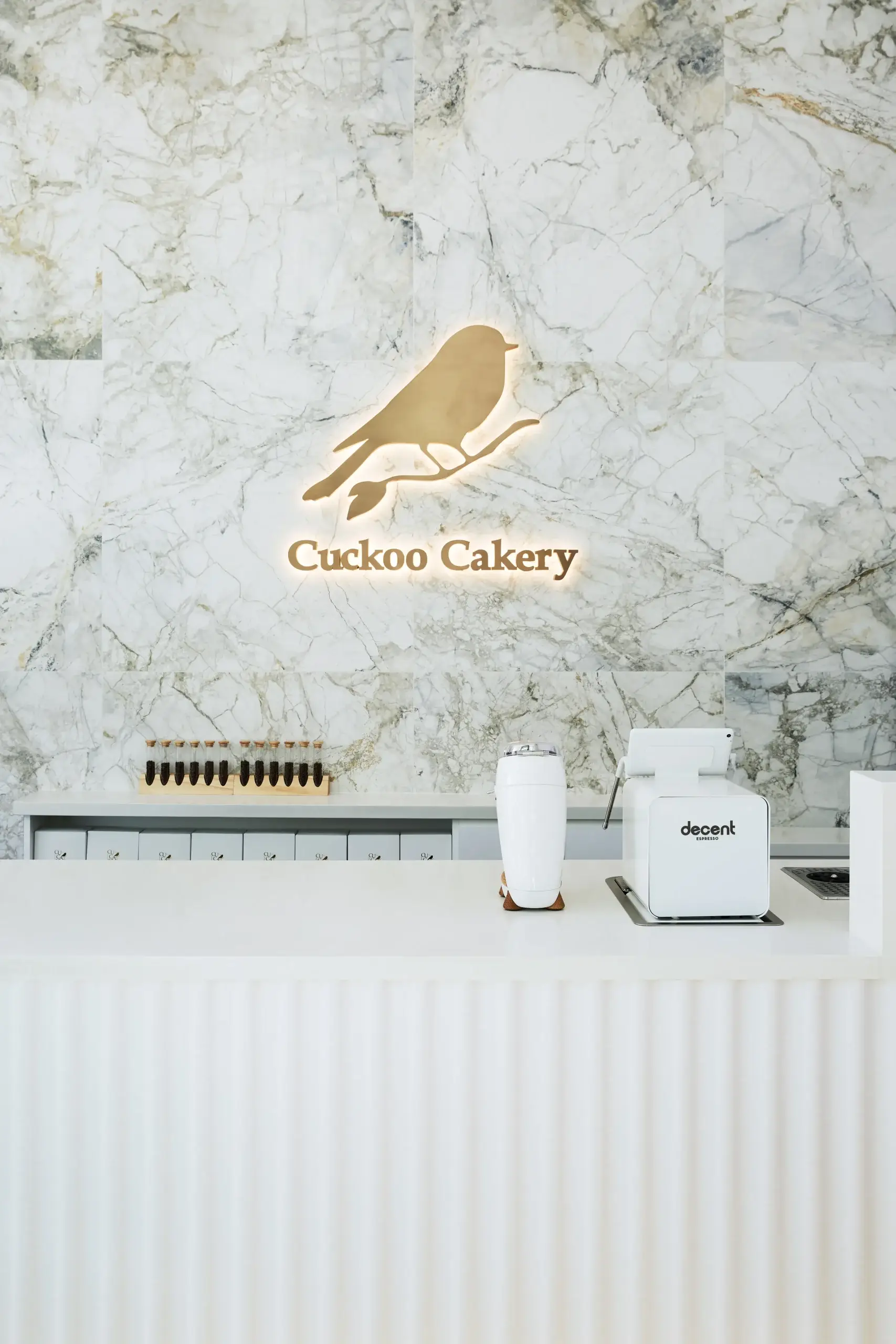
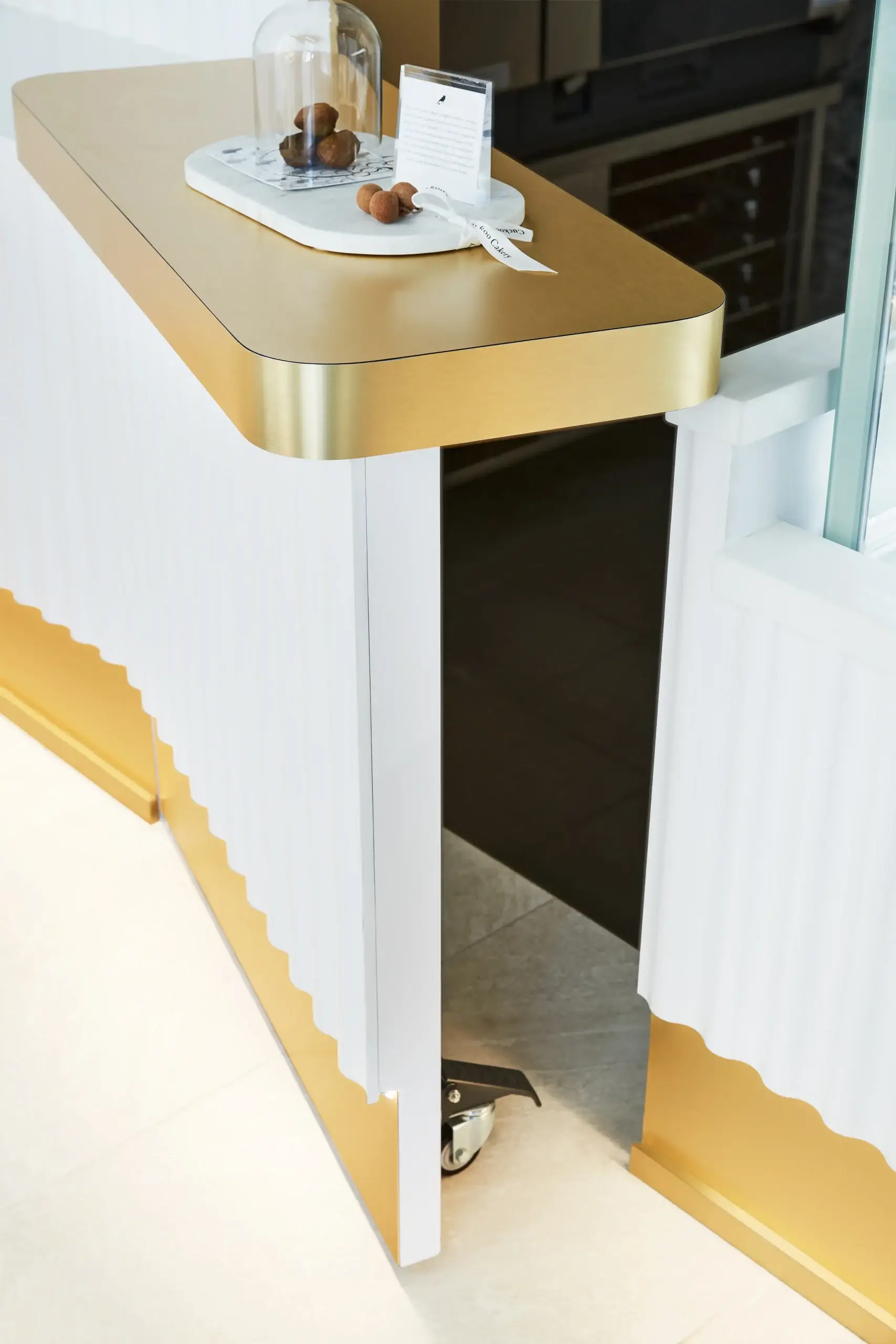
At Cuckoo Cakery in Toronto, I had only 700 square feet. That small footprint still had to fit cake production, a sales counter, customer seating, and product display. Every single inch had to be considered. There was no room for guesswork.
Build the Order Path so It Feels Easy
In a tight bakery, I like the cash to face the entrance. The display goes right next to the cash. The menu stays in that same zone. Then the next move is the pickup area.
Why does that work? Because while the customer is ordering, they are already looking at the display. That helps sales, and it also keeps the sequence clear. People know where to stand, where to pay, and where to move next.
Behind the counter, I get even more detailed. If there is a coffee machine, where does it go? Where is the ice maker? Where is the hand sink? Where is the prep area? Where does the staff cross each other? Where is the plumbing already located?
These are not small questions. An efficient kitchen layout and clear flow maximize labor productivity, and I see that on site all the time. If the team has to take extra steps every few minutes, the cost adds up every day.
I also plan equipment very carefully. Sometimes, if I place things in a smart way, I can avoid major structural or plumbing changes. That can help reduce permit complexity and save valuable time before opening.
Never Cut Storage
Storage Protects the Look You Paid For
Many first-time owners want to cut storage first because they think customers will not see it. I usually push back. Storage is what keeps the front of the bakery clean.
If you do not plan storage properly, boxes, packaging, cleaning supplies, extra stock, and small tools will spill into the visible areas. Then the bakery stops feeling polished, no matter how nice the finishes are.
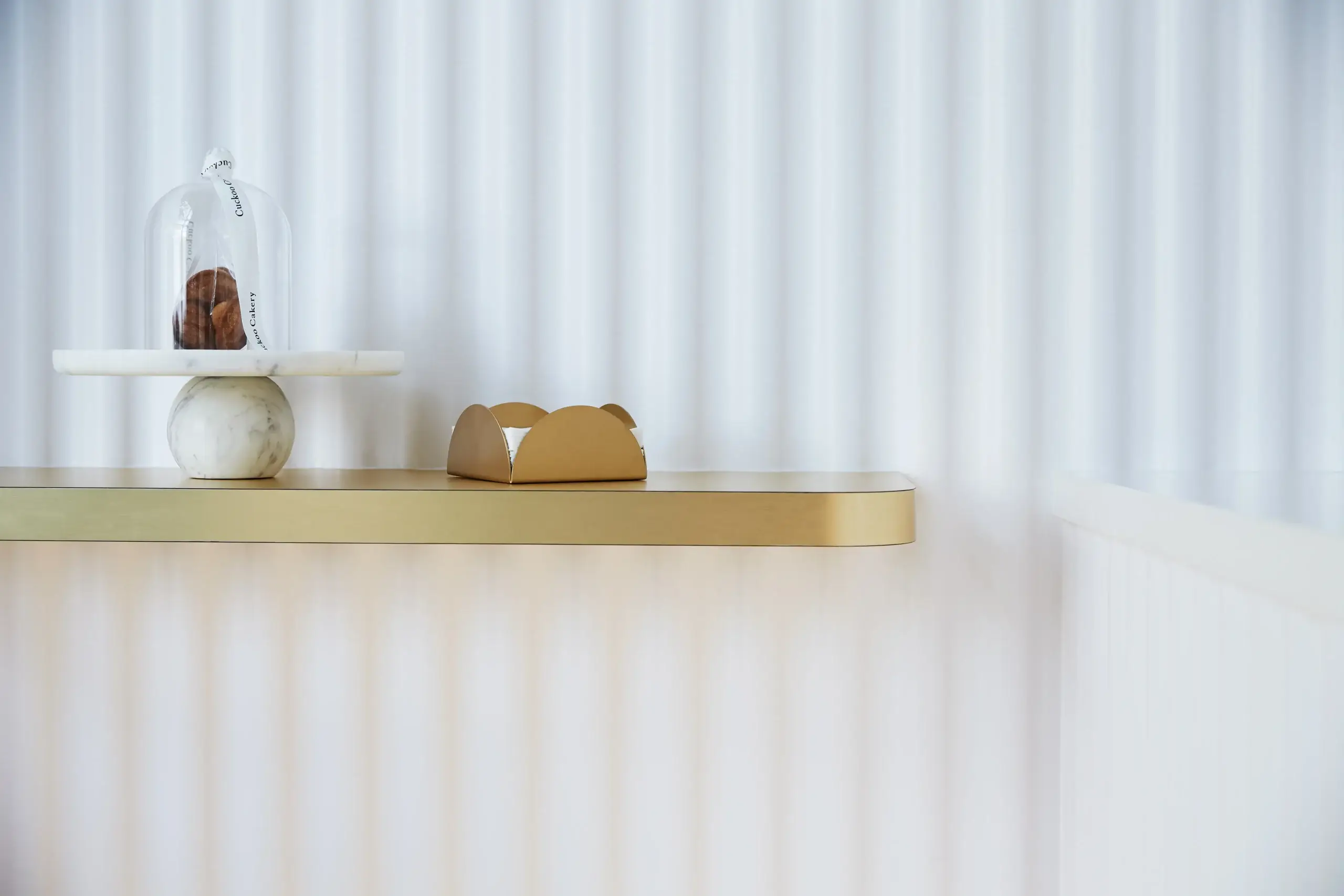
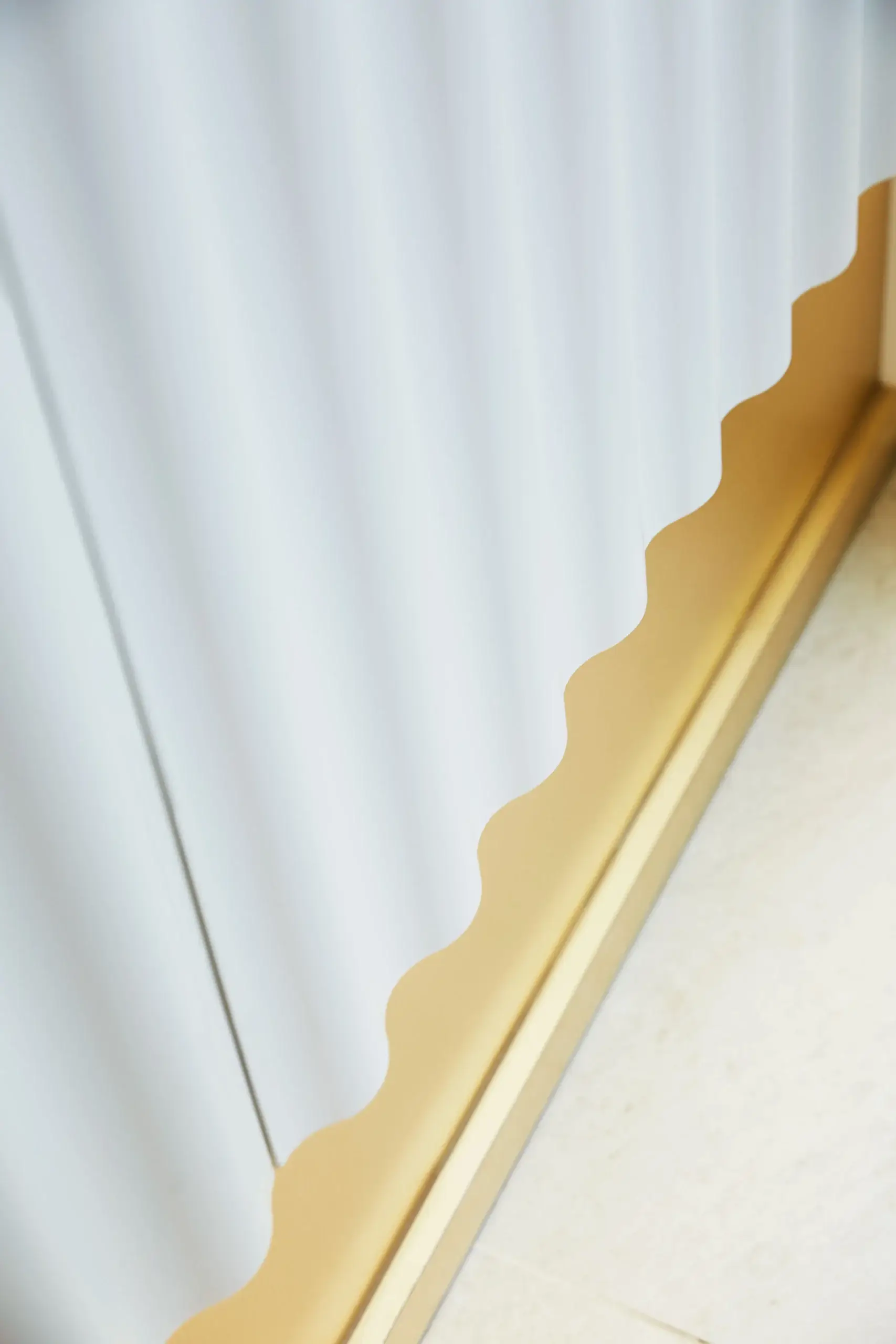
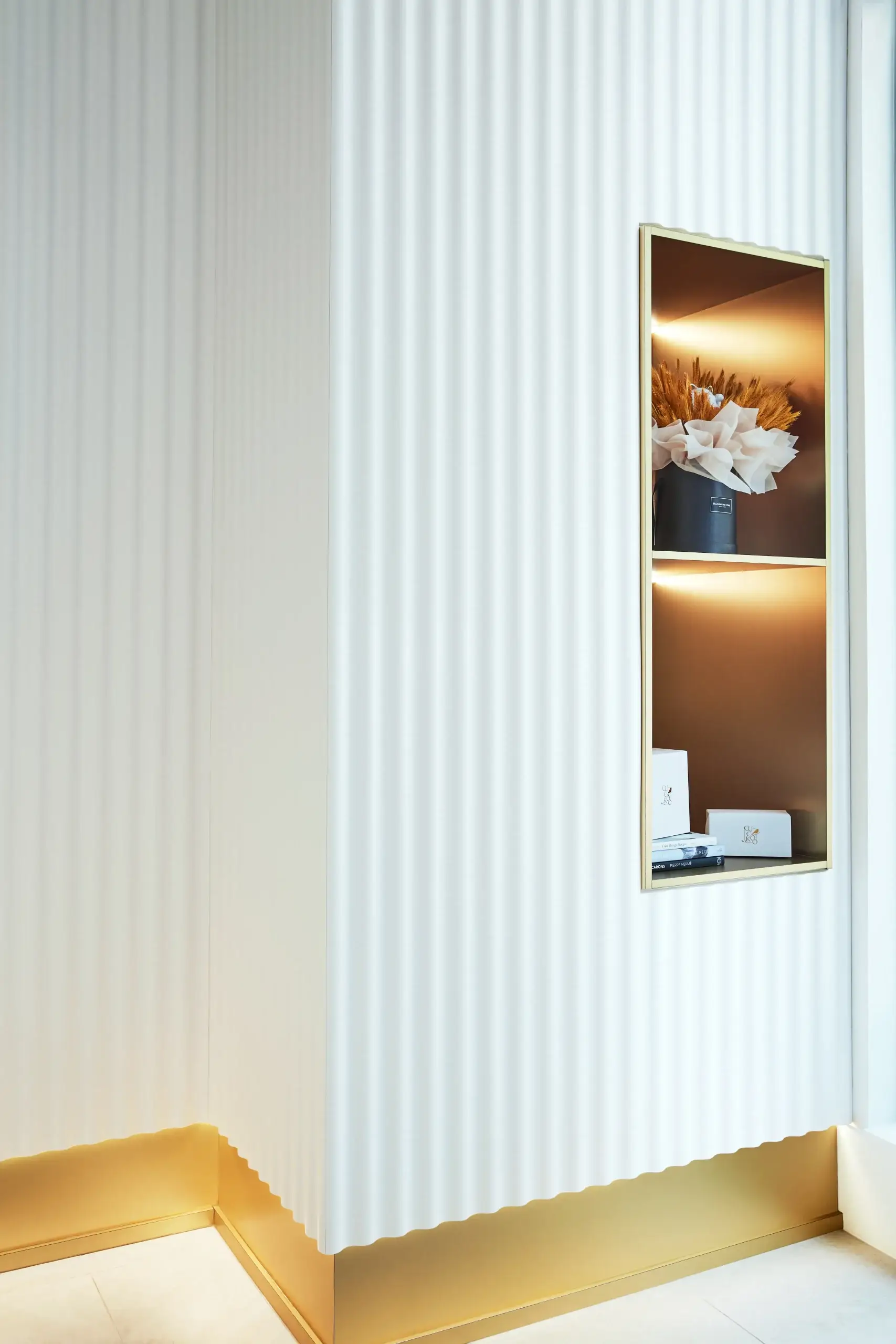
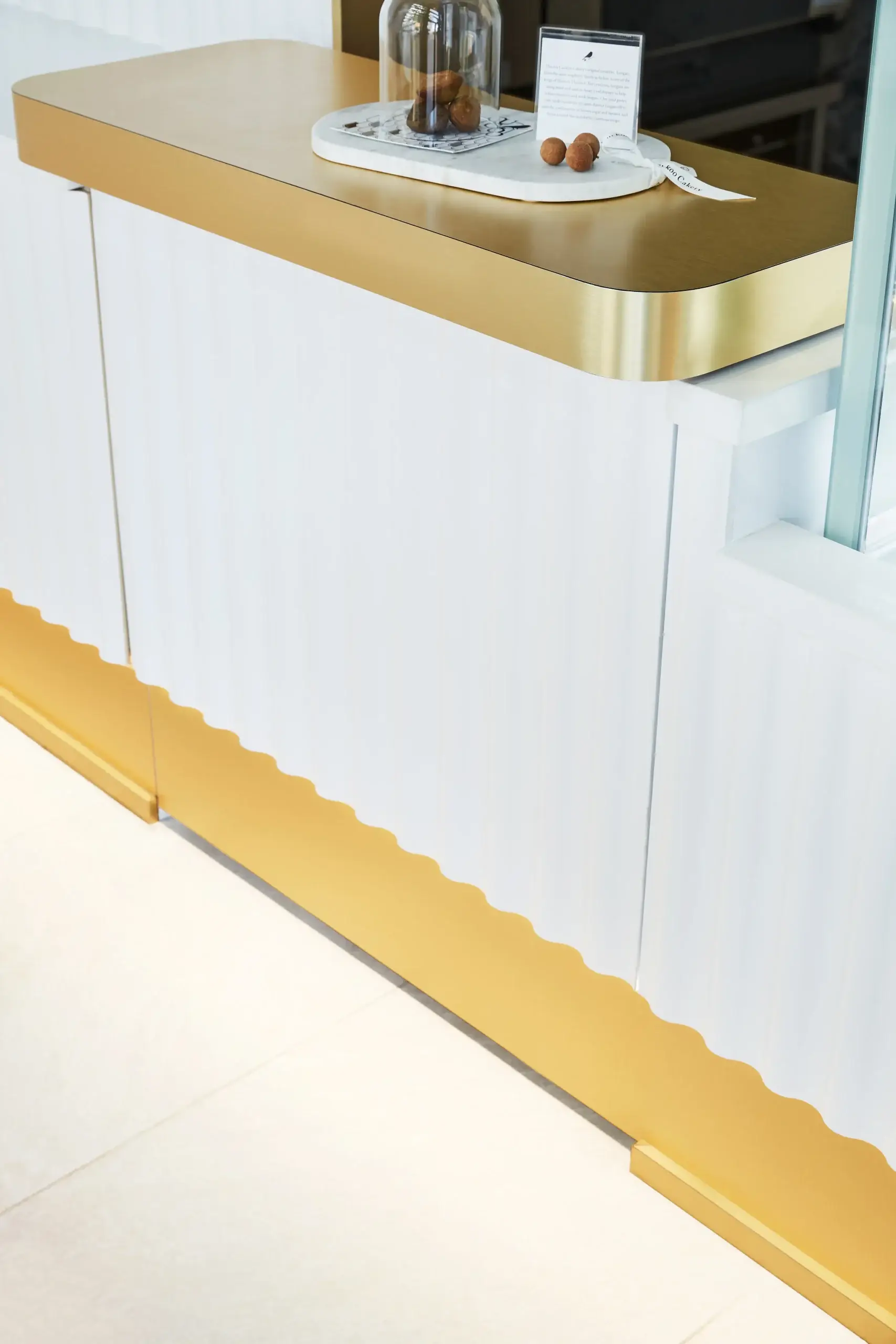
At Cuckoo Cakery, we hid storage inside the design itself. Our concept was a wavy wall inspired by the knife pattern of cake icing. That wall wrapped around the whole store, and behind it we built seamless hidden storage. Customers would not notice it was there.
We also designed storage into the display area. The top and bottom areas were used for storage, but the doors were hidden with push-pull panels so the surface stayed continuous. You still read the wave. You still read the story. But the function is working quietly behind it.
In a Small Bakery, One Element Should Do Two Jobs
This is one of my favorite strategies in tight commercial spaces. I want one feature to do more than one job. If millwork can be display and storage, that is strong design. If a feature wall can be branding and hidden function, even better.
At Cuckoo, we also used the upper space at the back of house for extra shelving and storage. That move helped keep the customer-facing area calm. The front stayed light, clean, and focused on the cakes and pastries.
That was very important to me. I wanted a less-is-more approach so the merchandise stayed the true heart of the space.
Spend Smart: Where You Can Save, Where You Must Spend
Put Your Money Into Layout First
When a startup owner starts panicking about budget, I slow the conversation down. I always ask the same thing first: what has to work every single day?
This is where I become very firm. The structure is like the human body. You have to have a good structure and then you put on your coat. In a bakery, the structure is the layout, the operations, and the circulation.
Boutique food-service interiors often benchmark around $100 to $180 per square foot for design and build-out. If your budget is below that range, you need to be very strategic from the beginning. You cannot spend like a luxury flagship and then hope the back of house will somehow work itself out.
I usually advise founders to divide the budget in a smart way. Most of it should protect the operational side of the bakery. Then I like to reserve about 10 to 20% for something memorable, usually a feature wall or a logo moment. That is the part people will photograph and share.
That balance matters. You need a wow effect, but you also need a business that runs properly on Monday morning.
Value-Engineer the Build, Not the Idea
Value engineering is part of my work on almost every commercial project. I am very practical about it. I do not want the design to lose its soul just because the numbers get tight.
Cuckoo Cakery is a clear example. Our original spec for the wavy wall was a prefabricated product from the U.S. It was taking too much of the budget. So we kept the concept, kept the shape, kept the pattern, kept the scale, and redesigned it for local CNC cutting. That cut the cost by nearly half.
This is the kind of move I always look for. Same design language. Smarter fabrication. Better control.
I use the same thinking with finish selections. New owners often get fixed on natural marble because it reads as luxury. Marble is beautiful, but it is also expensive. Today there are many good porcelain tiles and laminates that can maintain the marble look and bring the budget down a lot.
The same goes for solid wood. In the right application, a high-quality laminate can keep the look while protecting cost. I have used this strategy in residential projects too, like Rumsey Residence, where we saved money with laminate wall panels while still keeping the luxury feel. The lesson is the same in a bakery. Keep the visual impact. Change the method where it makes sense.
And if the budget gets very tight? I still do not give up on character. If an architectural feature has to be simplified, I use color, artwork, accessories, and strong styling to keep the space from feeling blank.
Use Lighting to Make Simple Materials Feel More Expensive
Good design is not just about color. Lighting is part of the whole experience.
For bakeries, warm lighting is a smart play. It helps pastries look more inviting. It softens simple finishes. It makes the whole shop feel friendlier from the street.
Research has shown that warm LED light around 2700K produced the highest sense of pleasure in dining experiments. That makes sense to me. In real spaces, I see how warm light changes the mood right away.
Material is a game player, and lighting is too. If you combine durable finishes with the right lighting, the whole bakery feels more elevated. You do not need expensive material everywhere. You need the right material in the right place, with the right light on it.
I also pay close attention to how the lighting supports the customer journey. The display should glow. The queue area should feel comfortable. The counter should be bright enough for service, but still warm enough to feel inviting.
Give People a Story to Remember
Branding, Story, and Interior Design Always Tie Together
Many spaces try too hard to be “Instagrammable.” I understand why. Social media matters. A bakery should absolutely have a feature people want to photograph.
But I believe branding, story, and interior design always tie together. If the feature has no connection to your product or your brand, people feel that right away. The space starts to look generic.
At Cuckoo Cakery, the wavy wall came from the idea of icing. That means the concept was already connected to the product. People standing inside the store could feel that bakery story around them. It gave the brand something real to talk about, and it gave customers a reason to share it.
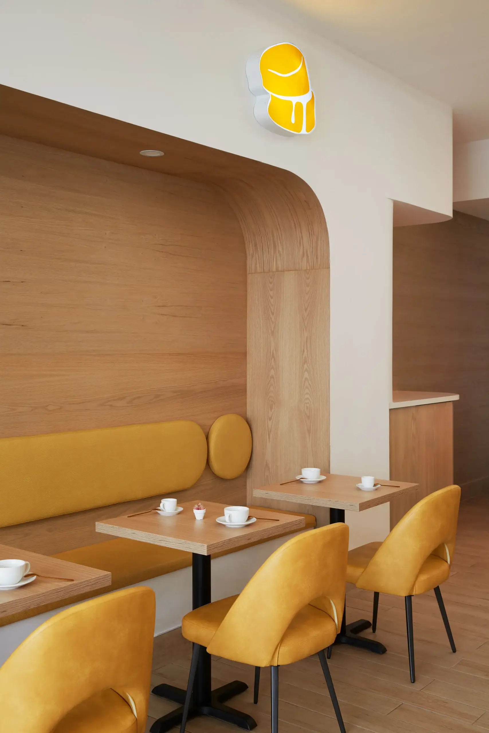
I use the same thinking across other startup spaces. At The Cube Nail Lab, we built the concept around the idea of a Rubik’s Cube and carried that into the branding and the interior. At Fuwa Fuwa Dessert Cafe, the curved white forms and soft yellow seating reflected egg white and egg yolk. The story shaped the space. That is why the spaces feel complete.
Make the Feature Three-Dimensional
I like feature walls that have depth. I want them to feel built, not pasted on.
For bakery design, that usually means form and material working together. A 3D feature, a custom display, a textured logo wall, or a counter with real shape will always do more than a flat sign trying to carry the whole brand by itself.
This is where concept design becomes key. It is my favorite stage because that is where we unlock the narrative. Once the spirit of the project is clear, the material choices get easier. The space starts to speak with one voice.
A bakery should give a multi-layered, stimulating sensory experience. People should read the brand in the wall treatment, the lighting, the flow, the millwork, and the display. Every space should sing and dance. Even a small bakery can do that.
Open Faster and with Less Panic
Speed Matters Because Rent Is Already Running
This is the part many first-time owners underestimate. A beautiful design that takes too long to document and build can hurt the business before the doors even open.
Most studios take one to two months to produce a commercial construction package. At Dexign Matter Studio, we built our own in-house drawing system so we can cut that timeline down dramatically. In many cases, we can produce a full construction package in about two weeks or less.
That speed helps, but only if decisions are made clearly at the beginning. I put a lot of weight on the conceptual development stage. Once the layout, story, and material direction are approved, the rest can move faster and with fewer mistakes.
We also maintain tight control during construction by partnering with teams that use their own in-house workers. That gives us stronger timeline control than a project that depends too heavily on outsourced labor and shifting availability.
Plan Sourcing and Soft Opening Early
Sourcing has to be scheduled properly. Lighting often needs to be local because it must meet code and pass inspection. Furniture and tile can be sourced overseas when it makes sense, but the schedule has to be smart.
For example, tile often needs to be ordered about two months ahead of when it is needed on site. Loose furniture can come later. If it arrives too early, you will need storage and you create extra cost for yourself.
If a project is close to opening but still needs final touch-ups, I often plan for soft operations at about 90 to 95% completion. That gives the owner time to train staff, test the counter, and see if any small physical changes are needed before the full public launch.
I like this stage because it reveals real-life issues. Maybe the pickup zone needs adjustment. Maybe the counter needs a small change once staff start using it. Better to catch that during soft opening than after your grand opening weekend.
My Advice to First-Time Bakery Owners
If you are opening your first bakery, keep this simple. Protect the layout first. Protect the storage. Build one strong story people can remember. Spend smart on the visible moment, but never steal money from the operational backbone.
Use warm lighting. Use durable materials. Value-engineer with intention. If an imported product is too expensive, ask whether it can be made locally in a smarter way. If the budget is tight, phase what can wait and protect what has to happen now.
I also think founders need guidance beyond finishes and furniture. In my studio, we often help first-time entrepreneurs understand the process, the budget logic, the phasing, and even financing questions. That support matters because panic leads to rushed decisions, and rushed decisions usually cost more later.
A bakery does not need a huge budget to feel special. It needs clarity. It needs discipline. It needs a design that solves the real problem in front of you.
I truly believe great designs change the way people dine, experience a brand, and remember a place. If your bakery is planned well, even a very small footprint can feel high-impact, polished, and full of personality. And when that happens, your space does more than look good. It starts working for your business from the first day.
Frequently Asked Questions
How much should a first-time owner expect to spend on bakery interior design?
Budgeting causes the most panic for first-time owners. Boutique food-service interiors typically require $100 to $180 per square foot for design and build-out. If you are below this, we must value-engineer immediately. I prioritize structural workflow first.
Should I sign my commercial lease before hiring an interior designer?
Never sign before we review the footprint. Many first-time owners lease a space only to discover it lacks the plumbing or electrical capacity for heavy production. Bringing a designer in early helps you avoid a location that will drain your budget on invisible infrastructure upgrades.
How do we handle heavy commercial equipment in a tiny footprint?
It is a puzzle, but we solve it through strict zoning. Planners suggest dedicating 60 – 70% of the floor area to production. We map your equipment first. An efficient kitchen layout maximizes labor productivity, saving you money every single day.
Do commercial building permits delay the opening of a new bakery?
Yes, permit delays are a massive pain point when rent is running. That is why speed matters. If we strategically place equipment near existing plumbing, we avoid major structural changes. This reduces permit complexity, pushing you through the city approval process much faster.
How can my bakery stand out on a crowded street if my budget is tiny?
You do not need expensive materials everywhere to capture attention. I rely on bold, 3D feature walls built via local CNC fabrication, paired with warm 2700K LED lighting. This combination draws people in and gives them an immediate reason to share.