I still remember the cool touch of the marble beneath my feet on the night Yuan Chinese Cuisine opened. Everything around me gleamed—ink-wash style luxury wallpaper, Italian-imported woven fabrics, and dark triangular mirrored mosaics with beveled edges. Yet, the space held its breath. It was flawless in a catalog way, but something inside me whispered, “Let it exhale.”
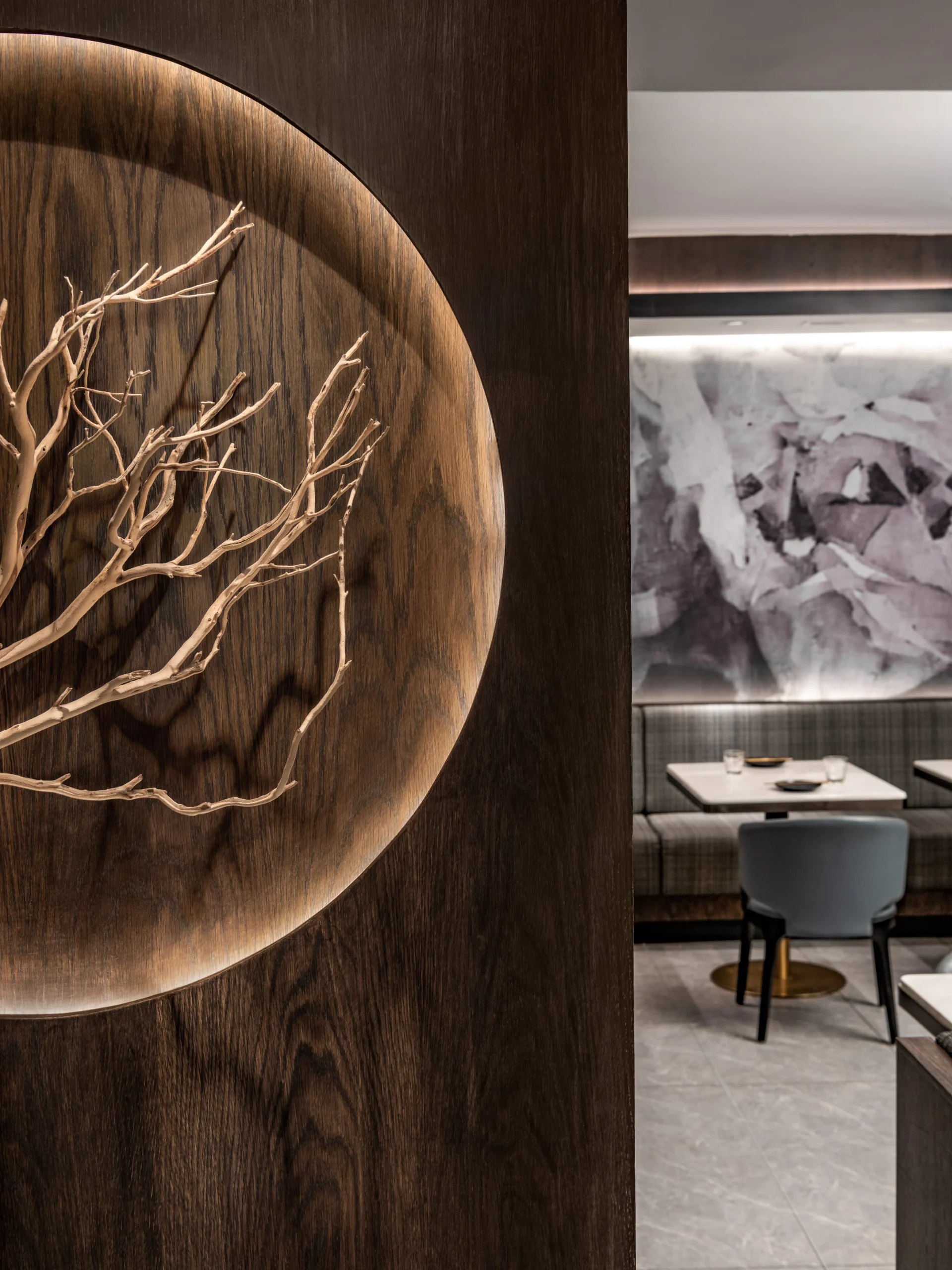
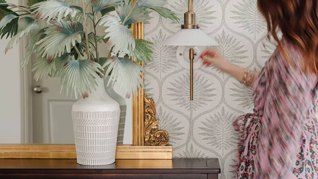
Two weeks later, during a routine walk-through, I convinced the restaurant owner to add a tree-trunk installation at the entrance. Guests began to pause there, photographing the irregular twists of the branch’s growth and asking where it came from. The restaurant started to talk back.
That is the power of juxtaposition: a single note in a different key can wake an entire composition. And that is why I want you to stop matching everything you own for a moment and start composing a layered, sensory life instead.

Why Our Reflex Is to Match - and Why It Suffocates Us
I grew up between Guangdong’s traditional courtyards and Shanghai’s modern skyline. In the ‘90s, a matching mahogany bedroom set carried the perfume of social status. My relatives saved for quite some time to buy the entire suite—bed, nightstands, dresser, mirror, identical handles drilled in perfect symmetry. The message was clear: sameness equals success.
That idea made its way to North America. Step into any suburban furniture showroom today, and you’ll still find the “complete package” priced by the pallet. It promises safety: buy once, think never. My corporate clients—accomplished surgeons, tech founders, broadcasters—confess the same fear: If I let one element deviate, the room might unravel. Matching is an insurance policy against embarrassment.
But design is not static. Life scuffs the varnish; children tape constellations to the dresser; houseguests drape scarves across the chair backs. Uniformity ages fastest because a single flaw ruins the illusion. Worse, it erases narrative. A matched interior is a paragraph where every sentence repeats itself. There is no tension, no breath, no room for people to enter.
The Interior Designer’s First Question
Good design, as I tell every client at Dexign Matter, begins with a design problem, not a style. Your problem might be:
- “My open-concept condo feels like an echo chamber.”
- “Our family cottage is a museum of inherited furniture that doesn’t speak to each other.”
- “I host investors on Friday and kindergarten playdates on Sunday. How can one space perform both roles?”
Juxtaposition is my favorite answer because contrast carries dialogue. Dialogue creates order—and delight—without needing repetition.
Interior Design Perfected
How to Listen to Interior Spaces
At thirteen, I would cycle to Shamian Island at sunrise, perch on a stone balustrade, and sketch colonial facades meeting Qing-era details. Mossy brick under pale stucco, wrought iron against river fog—the collision felt strangely peaceful. My pencil learned early that harmony does not require uniformity. It requires conversation.
Years later, I worked at Burdifilek, where I helped reinvent Indigo’s flagship. The brand feared that digital retail had robbed people of sensory connection with books. They wanted a flagship that could teach people to fall in love with objects again. I translated this into tangible strategies: layered materials that resonate under the hand, furniture that creates intimate pockets in a large floorplate, tactile signage, and tactile merchandising—so the store felt less like a transaction and more like a small, urban salon.
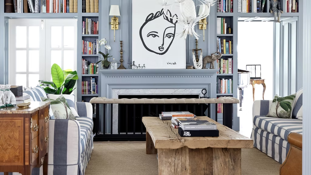
The Anatomy of Juxtaposition Interior Design
To explain the anatomy of juxtaposition interior design, I’ll frame the problem, then the solution, so you can translate the thinking into your own interior designs.
1. Color.
Problem: The client desired “a serene, gallery-like white.” After two weeks, the space felt like a dentist’s waiting room.
Solution: Place a twelve-foot vermilion canvas opposite the entry. Since everything else remains muted—cloud-white walls, bone-grey sofas—the red doesn’t shout. It anchors. The tiny veins in a Calacatta coffee table pick up that same ember tone, and now the whiteness gains depth rather than sterility. Harmony through a single, strategic dissonance.

2. Material.
Problem: A downtown penthouse draped in polished marble looks spectacular on day one and terrifying once the owners host their first oyster night. They hovered, napkins in hand, over every countertop edge.
Solution: Introduce burned oak on the island waterfall and inset hammered brass trays into the bar. The resilient textures invite use. Accidental wine rings now read as patina, not failure. The luxe marble stays, but its perfection no longer intimidates.
3. Scale.
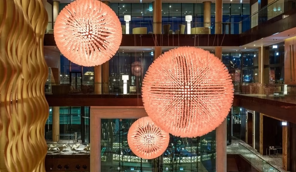
Problem: The boutique hotel’s atrium rises three stories, but guests avoid it. The empty space feels like a shopping mall.
Solution: Suspend a low constellation of hand-blown small glass orbs, hung by delicate bronze rods. The micro-elements pull the ceiling downward just enough to humanize the volume without denying its height. Scale speaks to scale. Paradoxically, the giant space feels larger because you can read its dimensions in layers.
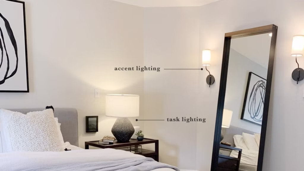
4. Light.
Problem: Lighting that feels safe also feels dead. It flattens texture, erases shadow, and makes a room feel more like a workroom than a home.
Solution: Think of light as a little orchestra. Layer ambient, task, and accent lighting. A warm, dimmable pendant above the dining table defines the ritual. Small, movable wall lamps by the sofa shape warm, cozy chat zones. A slim hidden light under the shelf brings out the timber’s grain. The result is a space that answers activity and mood rather than a uniform glare.
5. Pattern.
Problem: Have you ever had a client bring you a mix of Pinterest boards, for example, ikat, herringbone, and florals?
Solution: Choose a single hero pattern for the entry of an overscale, inky botanical. Let only its movement reappear elsewhere: the gentle torque of a faucet handle, the curve of a sofa back. You want to abstract patterns into form to allow complexity without chaos.
6. Story.
Problem: Every surface in this custom-built home is high-end, but the house still feels anonymous.
Solution: Talk with the homeowner. You might find old, stylish furniture tucked away in storage. Restore it. Let the old world debate the new.
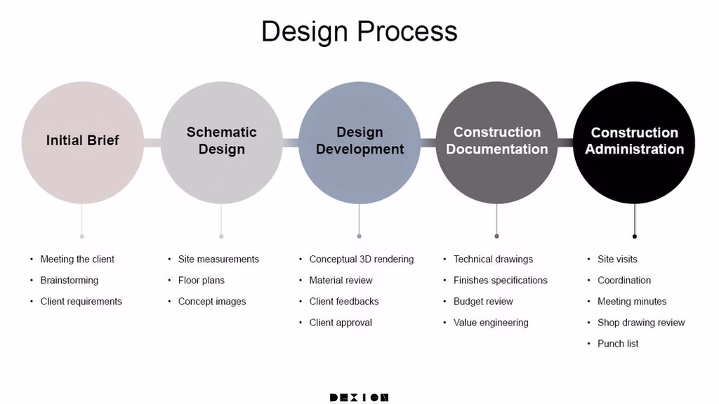
My Step-by-Step Design Process
Design, like a novel, hinges on structure. Here is how we build it at Dexign Matter.
Step 1. Discovery.
Our first meeting is ethnography: Where do you drop your keys? What music rinses your mornings? Which restaurant lighting makes you linger? These details shape an authentic brief.
Step 2. Thesis Sentence.
Every project receives one line. For example: “Elevate daily motion to ritual.” When choices later collide—Should the stair twist clockwise? Should the pantry door disappear?—we test them against that sentence. The thesis cuts through decision fatigue, something our overstretched, time-poor clients cherish.
Step 3. Concept Boards.
I craft boards that argue, not seduce. Conflict at this stage saves cost later. If a client hates the tension, we pivot before a single stud is moved.
Step 4. Technical Translation.
We document every junction in painstaking detail—FF&E schedules, millwork shop drawings, lighting simulations. Juxtaposition is unforgiving. A one-millimeter gap between limestone and steel reads as error. Precision is what turns drama into composure.
Step 5. Sourcing and Orchestration.
We source globally: a Quebec ceramicist’s bowls, Tuscan terrazzo, Kyoto washi pendants. Our GTA-based studios design, customs, and site coordination. You remain the author. We handle the footnotes.
How to Practice Juxtaposition at Home
Open your closet. Choose the softest knit and the crispest cotton you own. Drape them over the arm of your sofa so they overlap. Notice how each makes the other clearer.
Apply the same experiment to cut flowers against a concrete windowsill or a delicate teacup on a chunky oak board. You are training your eye the way I once trained my pencil—through small, tangible frictions.
Stay Informed on Interior Design Trends
Get our interior design insights right in your inbox.
Sustainable Contrast at Dexign Matter
Opposition also rescues resources. At Dexign Matter, we salvage stone off-cuts for powder-room sinks, pair FSC-certified walnut with recycled acrylic fronts, and frame antique doors inside new walls. You know when sustainability stops lecturing and feels appealing? It’s when materials that carry a history are paired with fresh, clever counterparts.
When to Call a Professional Interior Designer?
If your renovation crosses structural lines—plumbing stacks, electrical loads, glazing ratios – hire a professional.
My team integrates architectural advisors, Feng Shui consultants, lighting designers, and even acoustic engineers because harmony is holistic. A space is a living system. Pull one thread, and the whole tapestry shifts.
Let experts mind the tension so you can enjoy the music.
Final Thoughts
The next time an algorithm proposes the “perfectly coordinated set,” pause. Ask what story that sameness will tell—today, then five years hence. If the answer feels flat, introduce a counterpoint: raw linen near chrome, indigenous art under track lighting, childhood ceramics on a glass pedestal. Stand back and watch the space inhale.
When the wish for a larger, guided transformation appears and you want a home that does more than house you but echoes your life, contact us. My team at Dexign Matter is ready to sketch, model, debate, and polish until your rooms sing and dance in your own unmistakable key.
Because harmony is not an absence of conflict. It is conflict resolved into music. Stop matching everything. Start composing.
Frequently Asked Questions
How does negative space help create harmony in interior design when dealing with clutter?
Negative space makes rooms breathe and allows each element to shine. Professional interior designers use the 60-30-10 rule: 60% negative space, 30% furniture, 10% accessories. This creates visual balance while preventing clutter from overwhelming your interior space and helps achieve balance in great design.
What's the best way to create visual harmony using a secondary color in my room?
Choose one dominant color for 60% of your interior space, then use a secondary color for 30% of furnishings like side tables or textures. The remaining 10% should be accent colors in art or accessories. This color scheme approach creates visual interest while maintaining harmony in interior design.
How can I incorporate harmony when mixing different patterns without creating chaos?
Successful interior designers follow the rule of three: use one large-scale pattern, one medium, and one small pattern. Ensure all patterns share the same color family or one color that ties them together. This creates visual harmony while adding personality and visual interest to your interior space.
What role does rhythm and repetition play in creating harmony in interior design?
Rhythm in great design comes from repeating elements like wood textures, shapes, or materials throughout your space. This repetition creates unity and helps the eye move smoothly around the room. Balance repetition with contrast to avoid the "matchy-matchy" trap while maintaining visual harmony and interest.
How do I add a personal touch while maintaining visual balance in my interior design?
Incorporate harmony by displaying personal accessories in groups of odd numbers. Use the design process of editing: choose pieces that share one common element like material, color, or style. This creates visual interest while ensuring your personality shines through without disrupting the room's sense of balance.
What's the key to achieving balance in small interior spaces without overwhelming them?
Focus on creating visual harmony through vertical elements and light. Use the same color on walls and ceiling to expand the space visually. Choose furniture with legs to create positive space underneath. Mirrors and strategic lighting placement can make negative space feel larger while maintaining harmonious interiors.
How can I incorporate nature elements to create harmony and visual interest in my home?
Bring nature indoors through organic shapes, natural materials like wood and stone, and living plants. This creates visual balance between hard and soft textures. Natural elements add life to your interior space while helping achieve balance. The key is ensuring these elements complement your existing decor and color scheme.
How does lighting help create harmony and set the mood in interior design?
Light creates the environment and affects how all the elements in your room interact. Layer ambient, task, and accent lighting to create visual interest. Warm light makes spaces feel inviting and harmonious, while cool light energizes. Proper lighting placement helps achieve balance and showcases your interior design beautifully.
How can I create visual harmony when working with existing furniture and a limited budget?
Focus on unity through accessories, fabrics, and paint. Add throw pillows, art, or textures that tie existing pieces together using the same color palette. Rearrange furniture to create better visual balance. Sometimes the right balance comes from editing what you have rather than buying new furnishings for your house.