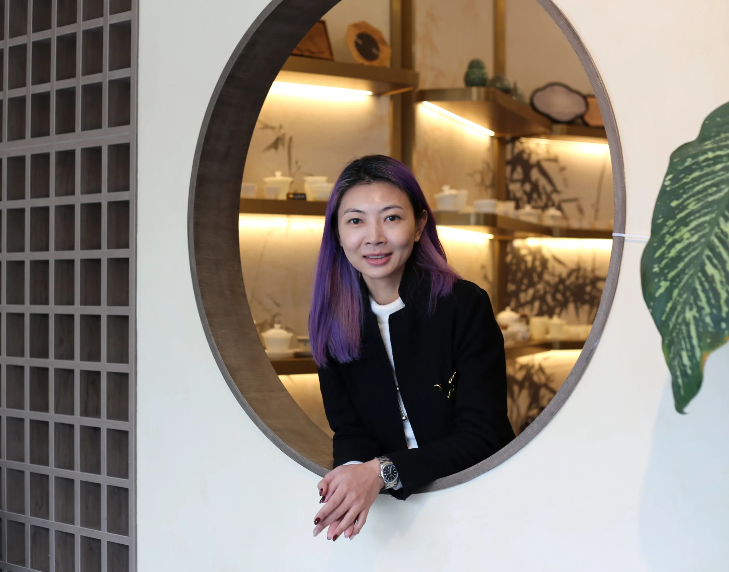
When I was 14, I was sketching an old opera house with my art tutor. That was the moment I understood something very clearly. A space can hold emotion the way a sponge holds water.
I still carry that idea into every project.
If you are opening your first cafe, bakery, salon, tea shop, or retail store, your interior has a very big job. It needs to express your brand. It needs to support your workflow. It needs to make people remember you. And very often, it needs to become your first real marketing tool.
This is why I take “Instagrammable” interiors seriously. They are part of the business strategy.
The numbers make that very clear. 45% of U.S. diners say they tried a restaurant for the first time because of a social media post from that restaurant. Toast reported that 62% of respondents sometimes check a restaurant’s social media before dining there, and 28% say they always do. Social media also brings people back. 22% of diners say restaurant posts enticed them to revisit.
If your concept is aimed at younger customers, the platform matters even more. Roughly 60% of U.S. teens report using Instagram. The market may vary by city, but the behavior is easy to recognize. People discover places online first, then decide where to go.
At Dexign Matter, my team and I have completed more than 150 interior projects across Canada. We work on residential homes, commercial interiors, and hospitality spaces, but the principle is always the same. A good design solves a problem well, supports the client’s goals, and creates a space people want to be in.
Start with the spirit of the project
The first mistake I see is starting with decoration. People collect nice images, save trends, and ask for a certain color or feature wall. I slow that down right away.
Before I think about finishes, I want to understand the spirit of the project. What is the feeling of the brand? What should a customer sense in the first few seconds? What should stay in their mind after they leave?
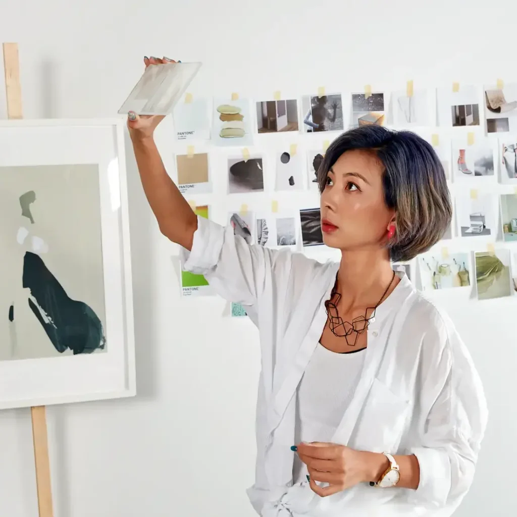
The conceptual development stage is the key stage in my process. It is where we unlock the possibilities and build the narrative that will guide everything else. I love this part because design is open ended. Sometimes the answer is a simple palette of colors and textures. Sometimes it means shifting walls or building custom elements to improve the space.
This is also the stage where first-time business owners should be very involved. I actually welcome that. Early conversations are where the strongest ideas often come out.
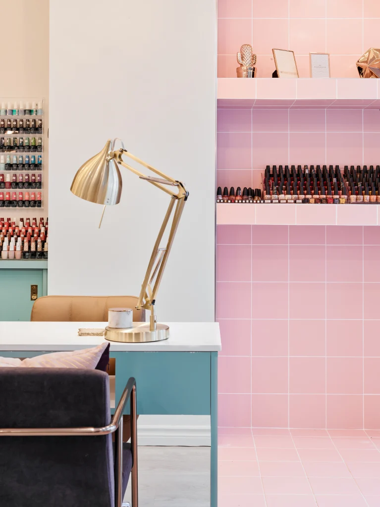
At The Cube Nail Lab, the concept came from the Rubik’s Cube. That one idea shaped the project name, the branding, the tiled grid, the feature wall, and the reception counter. It gave the business a clear identity from day one, and customers kept taking photos in front of those key features.
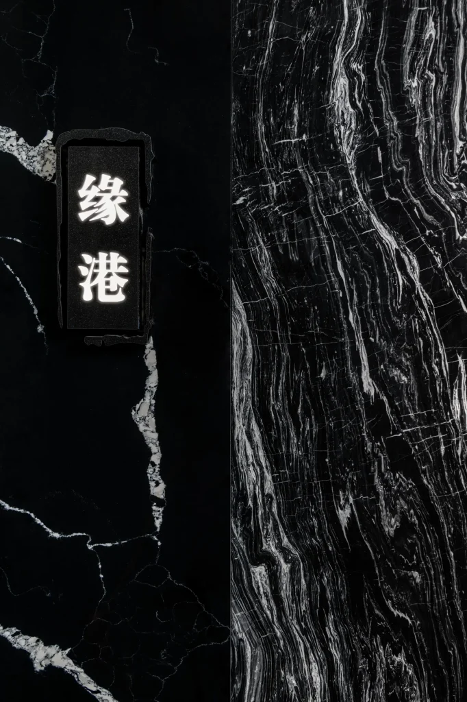
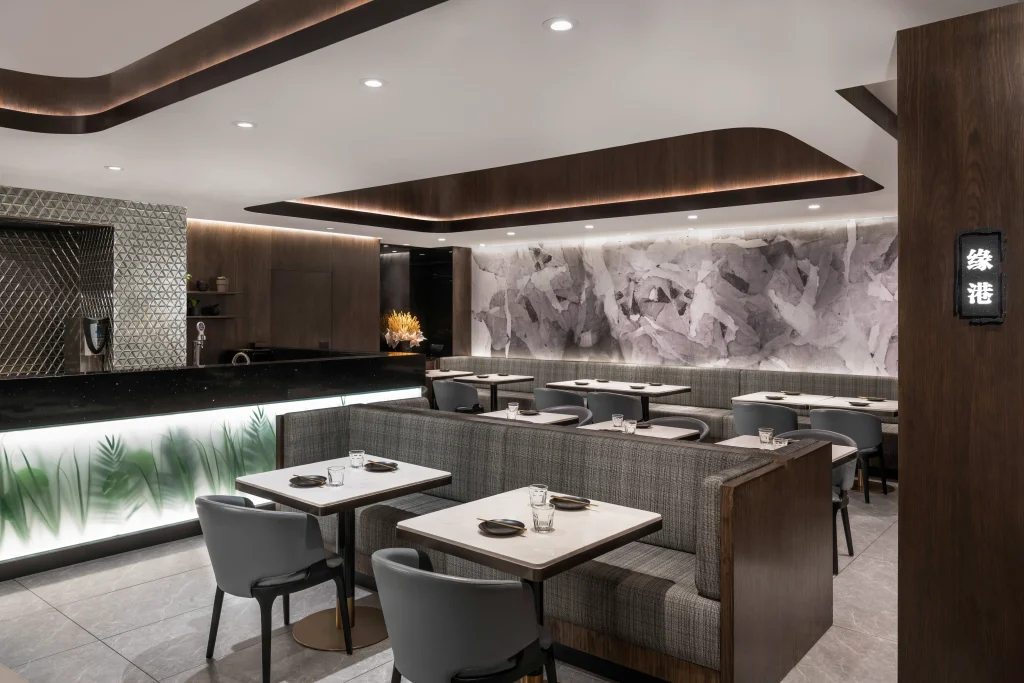
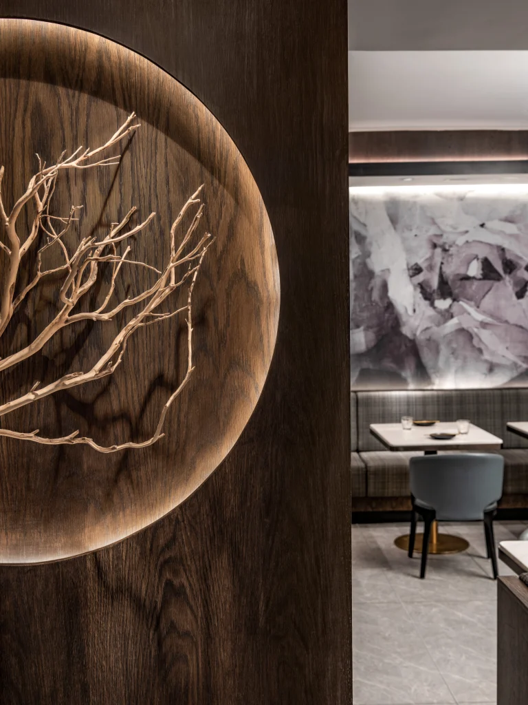
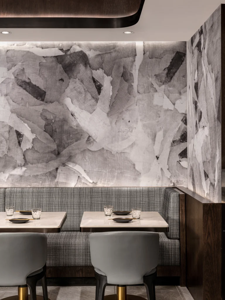
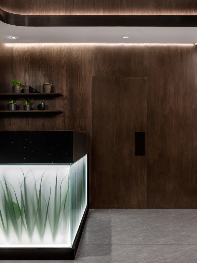
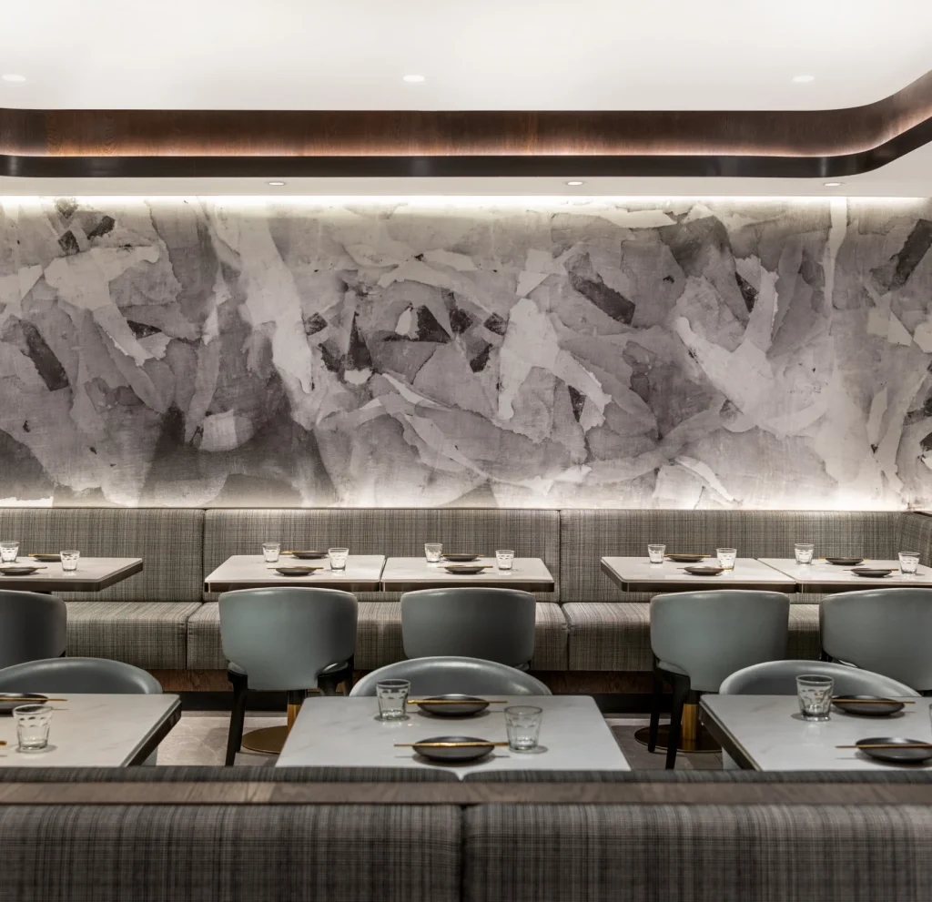
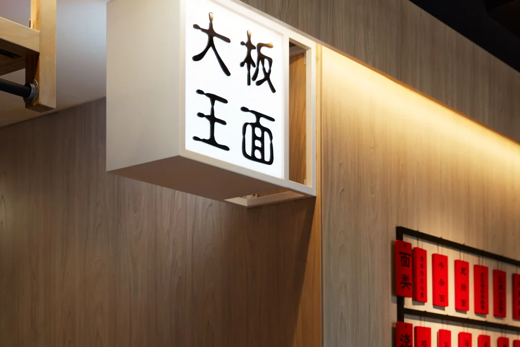
At Yuan Chinese Cuisine, I approached the design through the mood of Chinese ink and wash painting. The neutral grey and walnut palette, the custom black marble counter, and the large calligraphy-inspired mural all came from that one core story. The refreshed interior created social media buzz and significantly increased foot traffic.
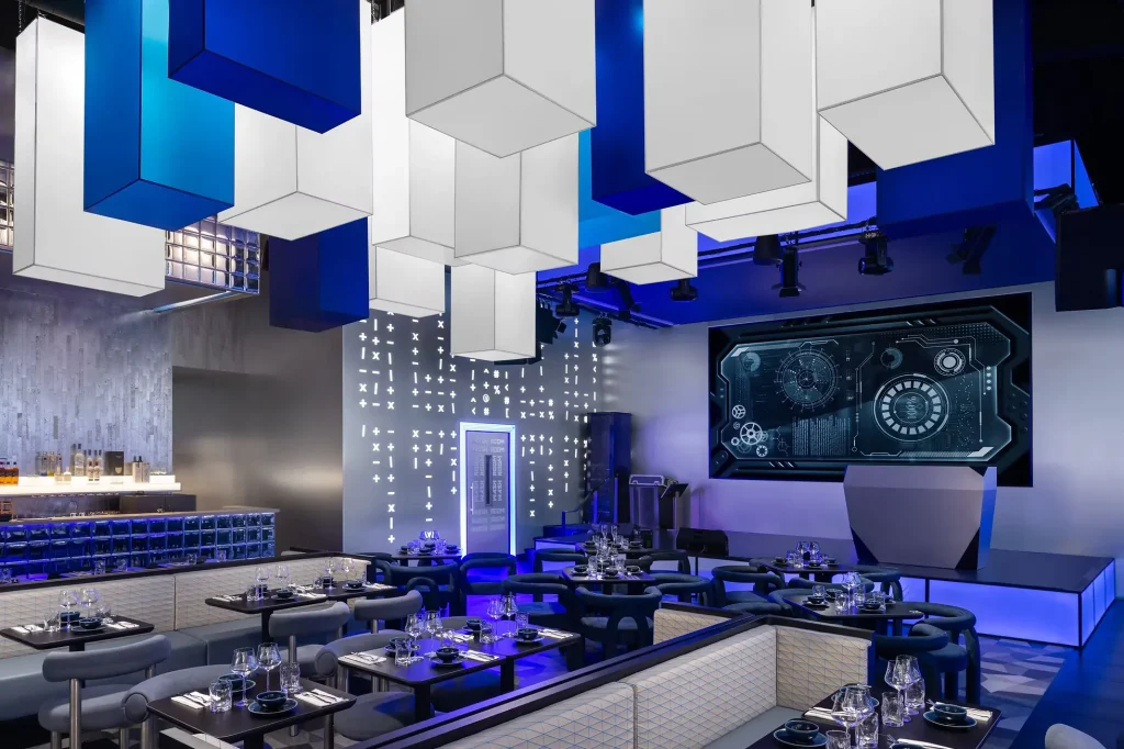
At H3 Matrix Restaurant & Bar, the narrative was space travel. That story moved through the entire venue, from the meteor-shower ceiling in the waiting area to the futuristic dining zones and metallic finishes. Because the concept was clear, the whole space felt immersive.
People may not know all the design language behind a project. They still feel when a space has a strong point of view. That is what makes them stop, look, and share.
Build the brand into the space
For a new business, the brand and the interior should grow together. I do not separate them.
Your logo, signage, layout, colors, materials, display style, and focal points should all speak the same language. When they do, the space feels complete. When they do not, the business feels generic very quickly.
This is especially important in crowded urban markets. If your first location looks like everyone else’s, you disappear. A clear brand identity gives people a reason to remember you and talk about you.
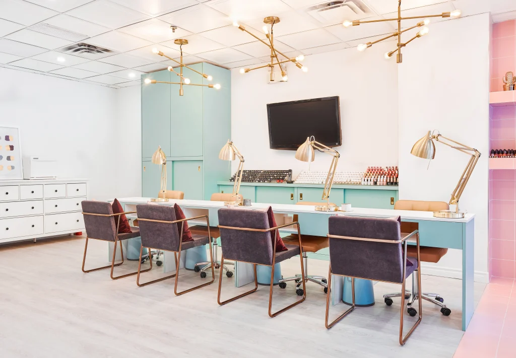
The Cube Nail Lab is a very good example of that connection. We did not just design the interior. We also helped shape the concept and branding. The grid idea moved from the name into the logo, then into the walls, the counter, and the shelving. The space felt playful, ordered, and easy to recognize.
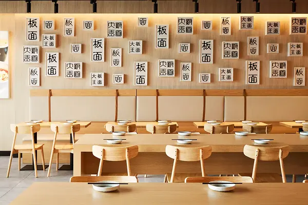
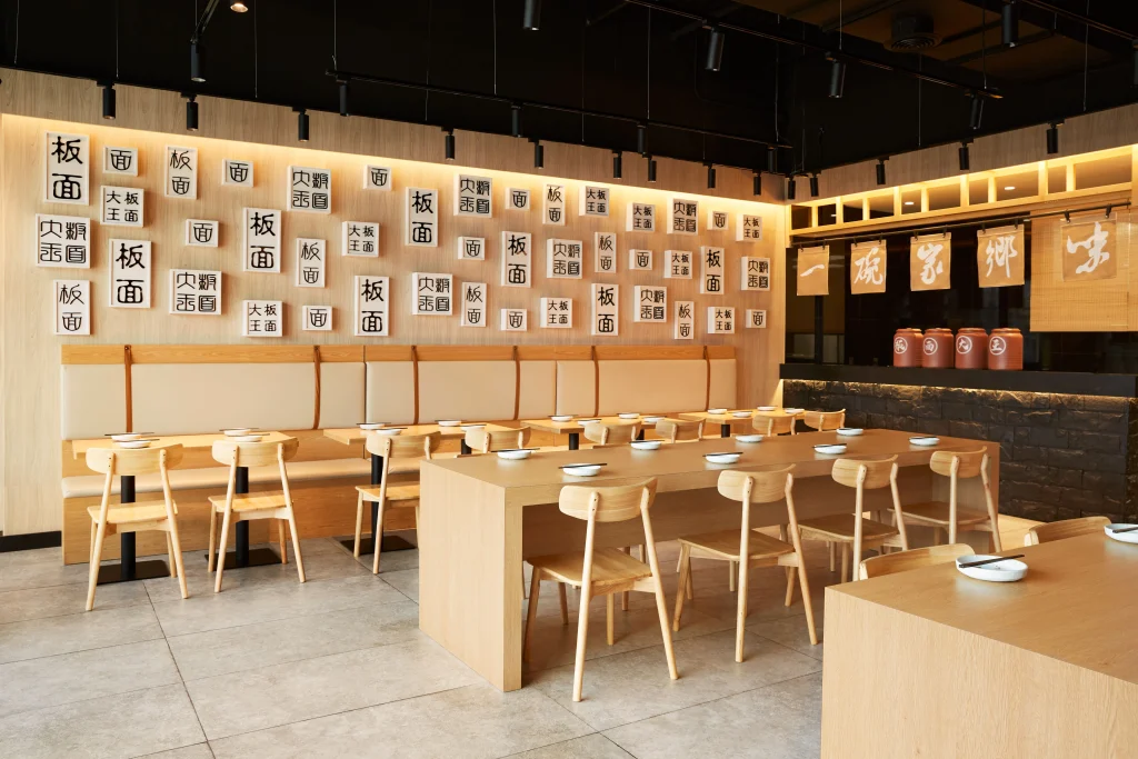
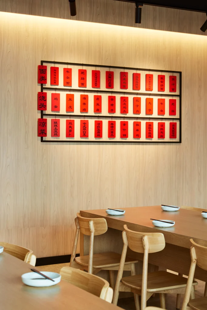
We took a similar early-stage approach with Noodle Legend. The client wanted to create a destination-worthy identity for a handmade Chinese noodle shop in North York. We focused heavily on branding in the beginning, then carried that direction into the physical space. The restaurant became an instant hit, and later we designed the second Noodle Legend location in Richmond Hill as an upgraded version of the first.
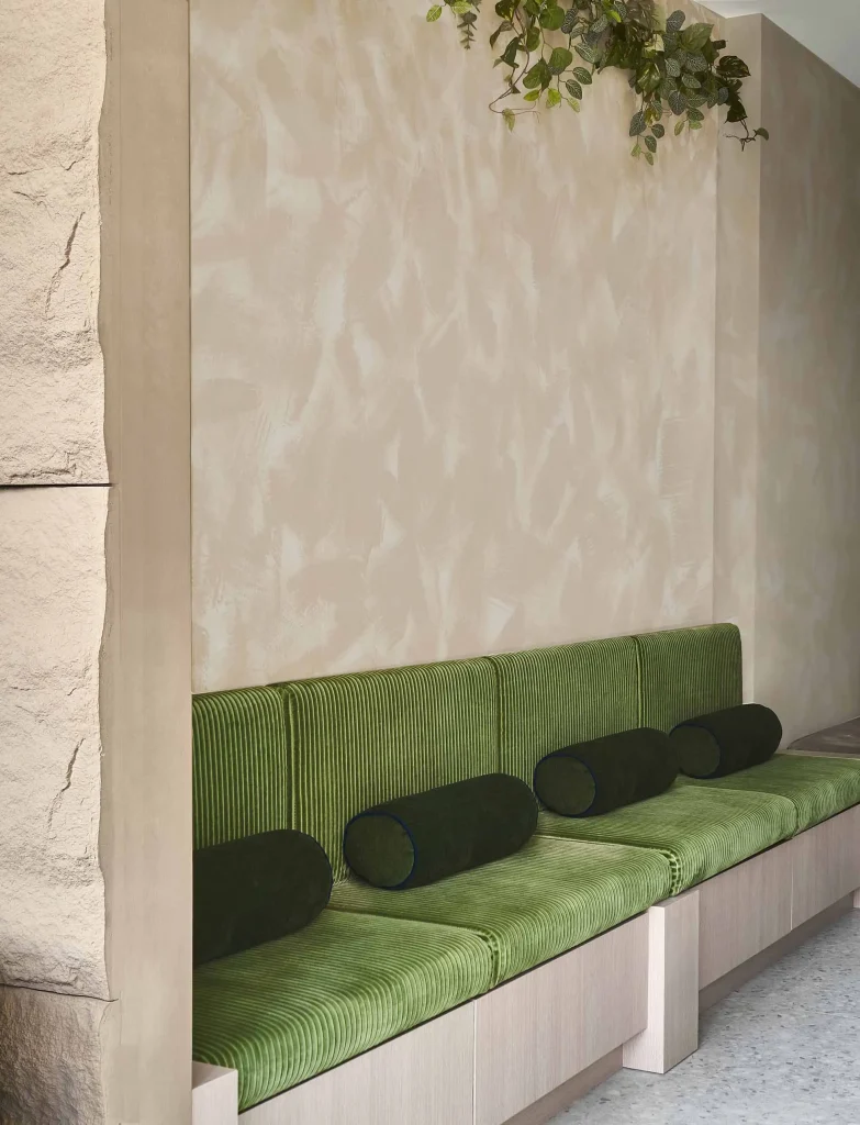
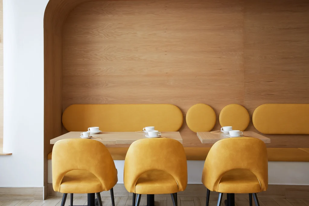
Even when there are brand rules already in place, the interior still needs personality. Fuwa Fuwa Dessert Cafe came with franchise guidelines for colors, materials, and finishes. We worked within that framework, but the final space still feels tailored and memorable because the curved booth seating, warm wood, and soft forms support the brand story in a very specific way.
I live in Toronto now, and I am always inspired by how the city’s many cultures shape design. I grew up in Guangdong and Shanghai, and I have worked in Singapore and Canada. That background has taught me that people respond strongly to spaces with cultural honesty. They can feel when a design has depth.
That is why I often work with provocative concepts and expressive narratives. They help a business stand apart, but they also help it feel real.
Create one strong feature people remember
Once the concept is clear, I look for the hero moment.
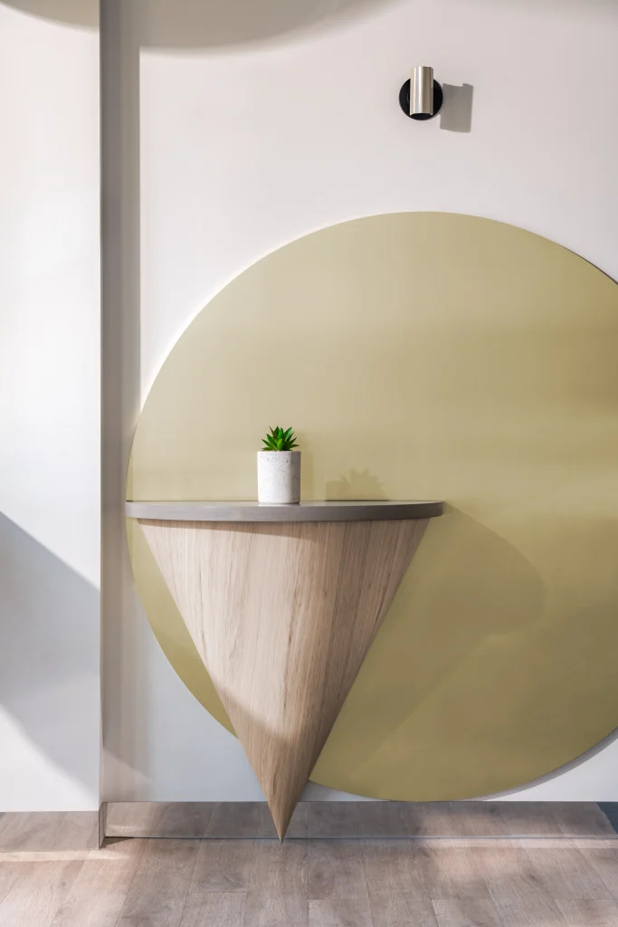
Every successful Instagram-worthy space needs one main feature that people connect with right away. It might be the entry sequence. It might be the ceiling. It might be the reception counter, a mural, a booth, or a custom display. The exact form will change from project to project, but the job stays the same. It needs to become the memory.
I do not believe in filling a small space with too many loud moves. One strong gesture, placed in the right location, has much more power.
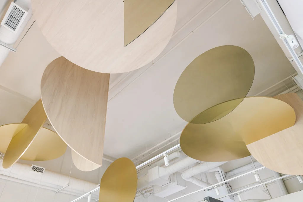
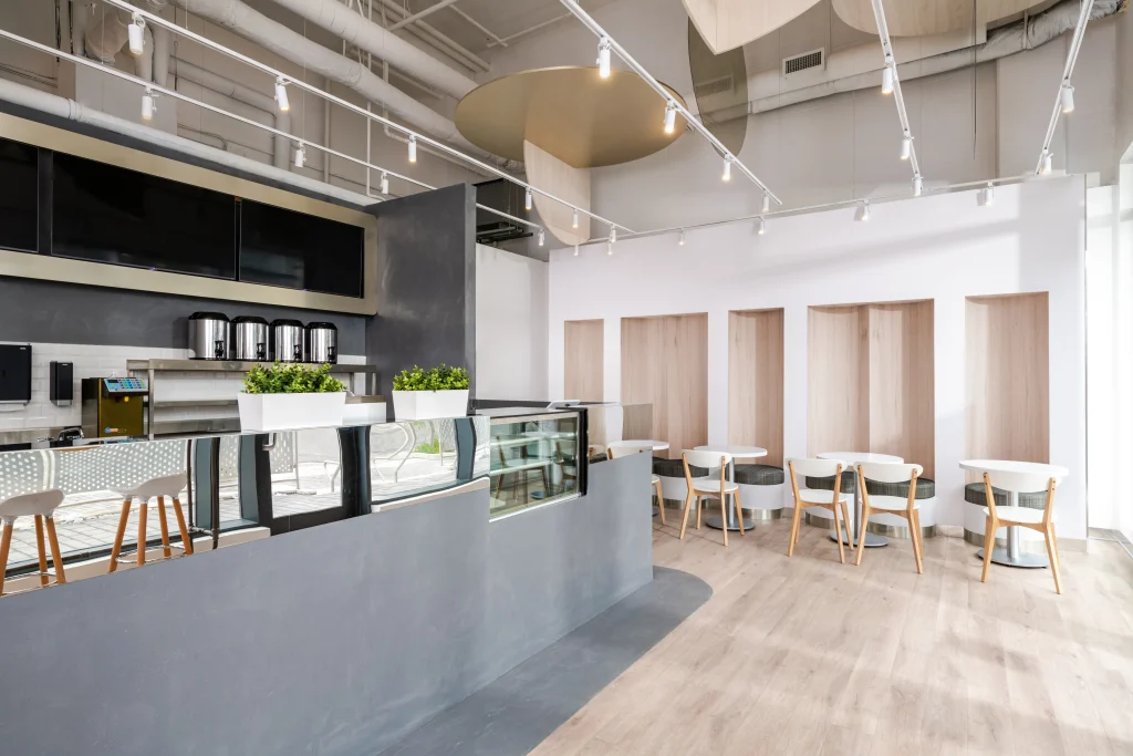
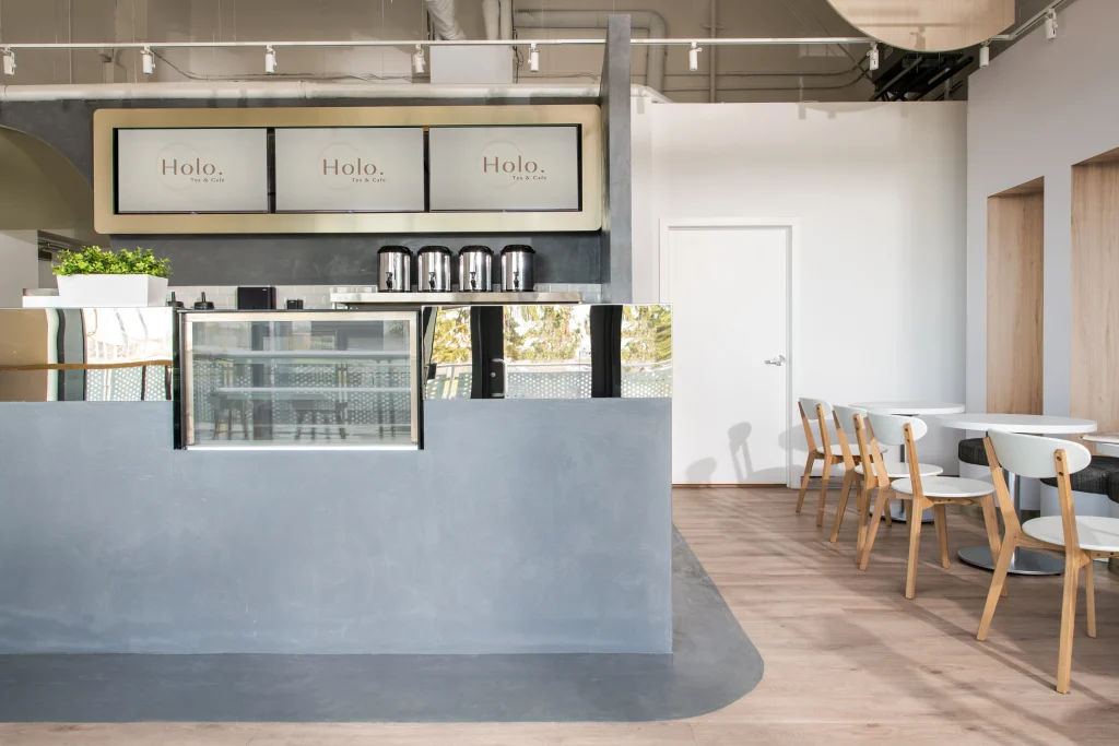
At Holo Tea & Cafe, the hero feature was the ceiling installation made from interlocking discs in champagne tones, wood, and transparent acrylic. That sculptural feature gave the space its identity. It later became the signature element that helped the cafe stand out in a competitive market.
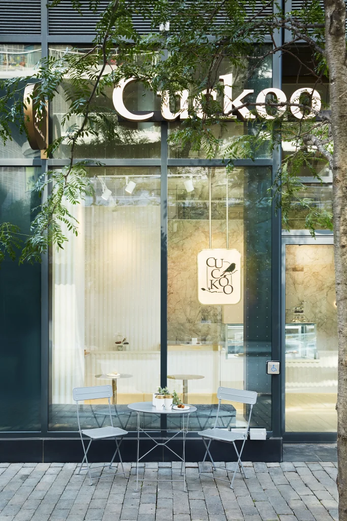
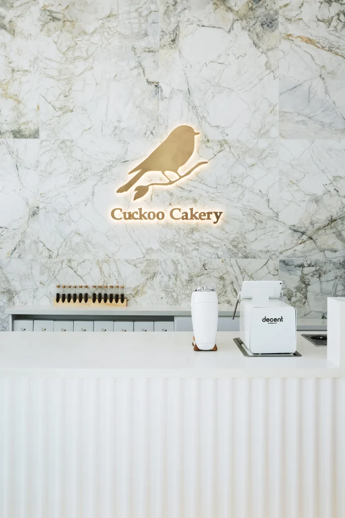
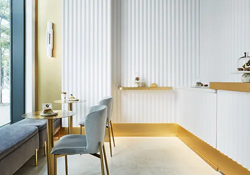
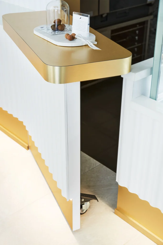
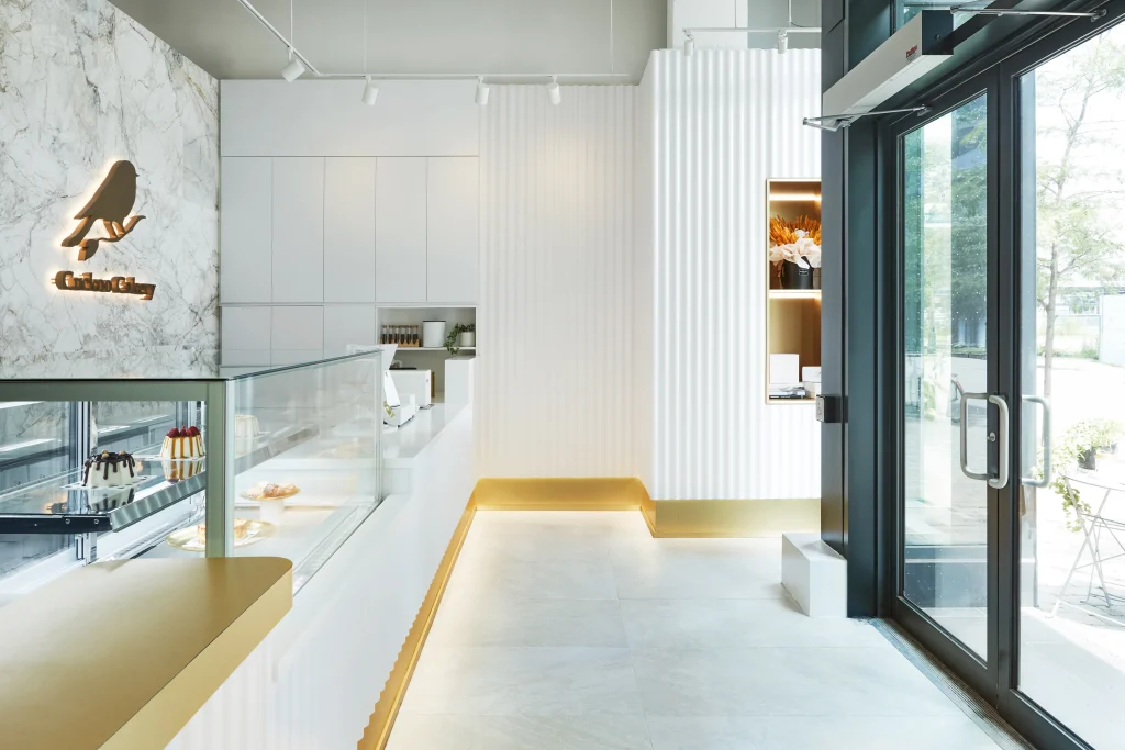
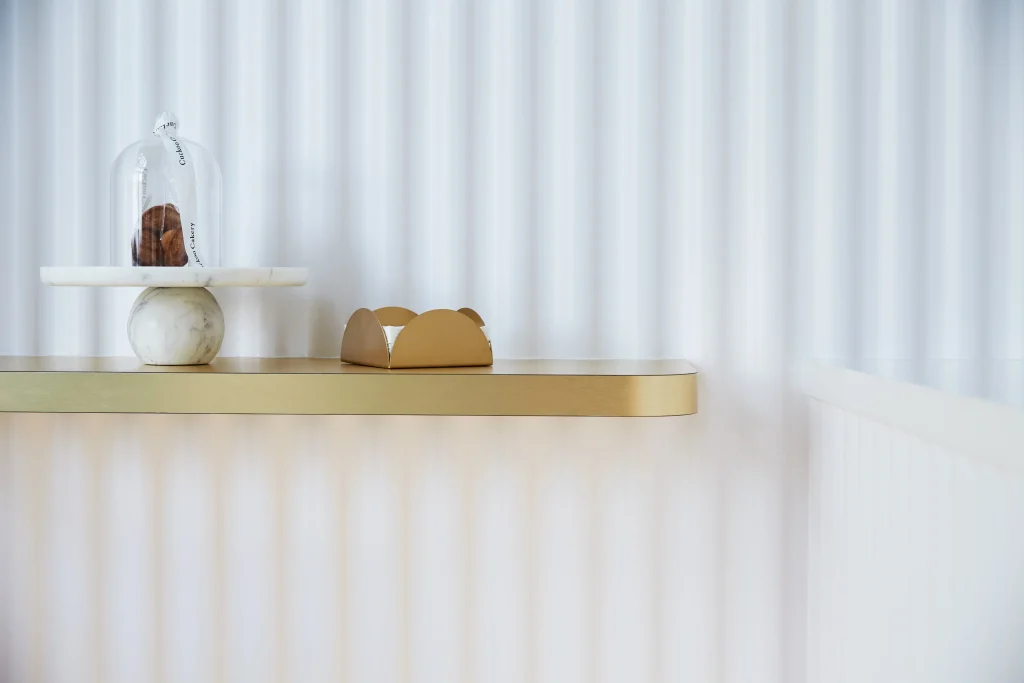
At Cuckoo Cakery, the hero feature was the wavy wall inspired by icing knife patterns. It was tactile, elegant, and very much in sync with the product. It also gave customers a photogenic backdrop without overwhelming the small store.
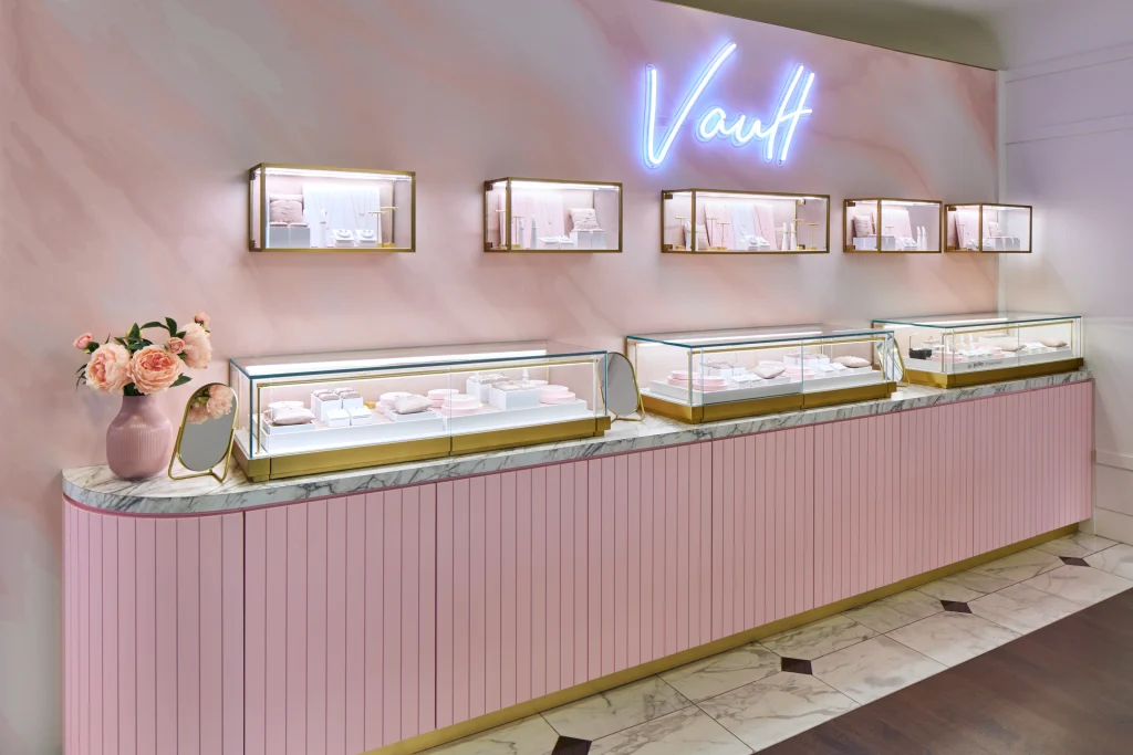
At Yuan Chinese Cuisine, the custom marble counter became the main focal point. At H3 Matrix, the entry and waiting area created the first dramatic impression. At Charmed Aroma’s first shop-in-shop concept, The Vault, the jewelry corner needed to feel like a destination within a larger retail environment, so the visual identity had to be very focused and very clear.
When I design these moments, I also think about how they will be photographed. There should be a wide view of the room, a closer view where a person can stand or sit, and smaller details that people naturally want to capture. The best spaces work at all three scales.
That is part of creating a multi-layered, stimulating sensory experience. The main feature draws people in. The smaller details keep them engaged.
Make the layout work before you choose finishes
I define good design by the result. The space has to solve the problem on hand.
For commercial interiors, that problem is rarely simple. You are dealing with building codes, traffic patterns, equipment, storage, customer flow, staff flow, durability, lighting, and budget all at once. This is one of my favorite things about the industry. Every project is unique, and every project asks you to think holistically.
If the space does not function well, the visual impact will not carry the business very far.
Cuckoo Cakery is a very clear example. It was only 700 square feet, but it had to fit cake production, a sales counter, product display, and customer seating. Every inch mattered. The space feels clean and refined because the planning was disciplined from the beginning.
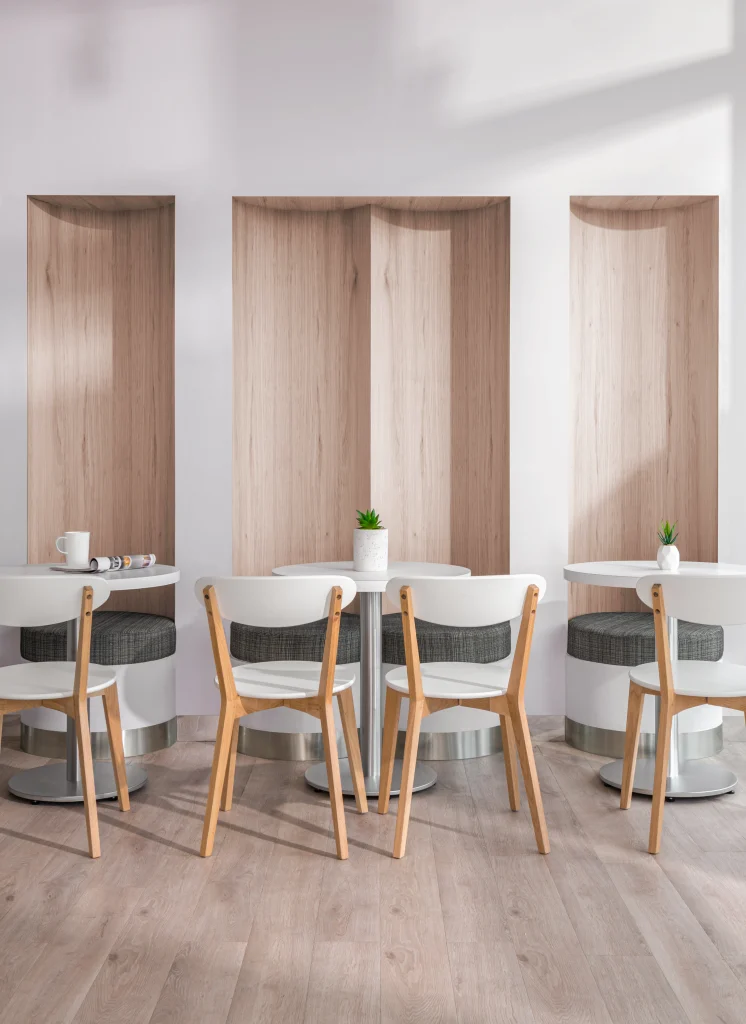
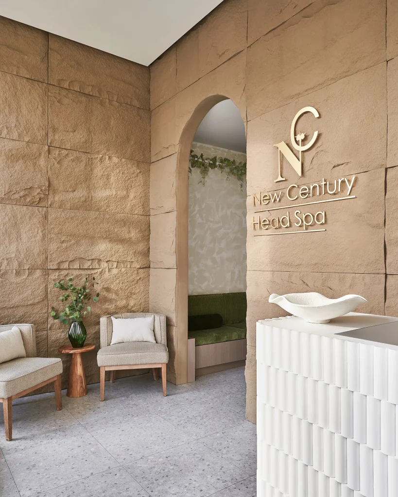
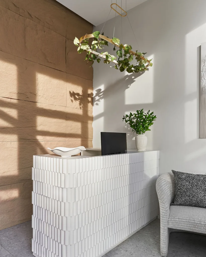
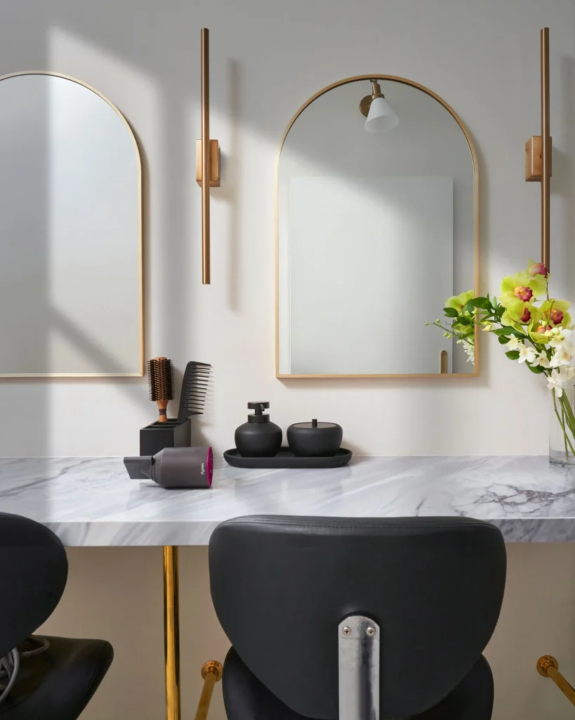
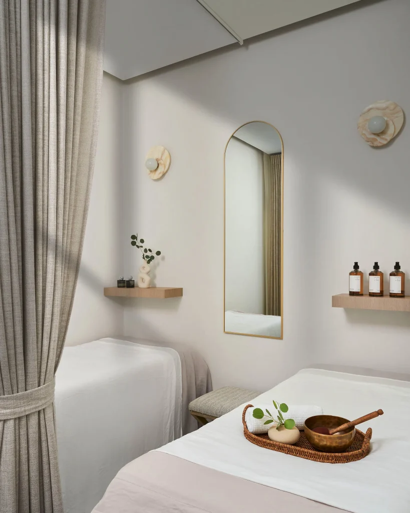
New Century Head Spa had a different challenge. In just 900 square feet, we had to fit four treatment rooms, six shampoo stations, reception, a waiting area, a foot spa, staff facilities, and an accessible washroom. Without very careful planning, the space would have felt cramped and stressful. Instead, it became a calm wellness environment that helped position the client strongly in a growing market.
H3 Matrix had the opposite condition. It was much larger, but it needed to support several different experiences in one venue. Dining, bar service, waiting, entertainment, and private areas all had to coexist. That required detailed zoning and very clear circulation planning.
This is the part many first-time entrepreneurs underestimate. A beautiful rendering is not enough. You need to think about where people line up, where they pause, where they pay, where products are displayed, how staff move behind the scenes, and how the space performs during busy hours.
I always tell clients to decide the operational logic first. Then we dress it up. I enjoy curating spaces, dressing up walls and adding finishes, but that visual layer must sit on top of a very strong plan.
Make the product easy to photograph
Many owners put all their attention on the room and forget the product. I think that is a mistake.
Your interior should support what you sell. It should frame the food, the dessert, the retail item, or the treatment experience in the best possible way. Social media data supports that thinking very clearly. The same Toast survey found that 84% of respondents preferred seeing photos of food and drinks on social media, while 47% wanted to see decor and ambiance. It also found that 57% said pictures of food were the top influence on their decision to visit, while only 10% pointed to ambiance.
That tells me something very practical. The interior matters, but it should never fight the product.
At Cuckoo Cakery, I kept the overall palette soft and restrained so the cakes and pastries remained the heart of the space. The wavy wall gives character, but the merchandise still holds the spotlight. At Fuwa Fuwa Dessert Cafe, the curved seating, warm oak, and soft yellow tones support the dessert story and make the counter area feel inviting.
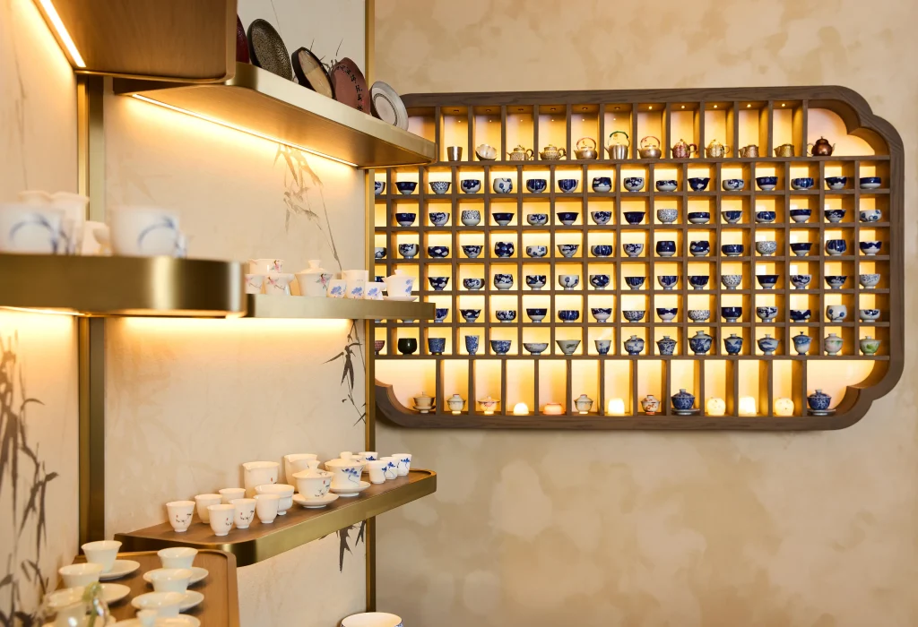
At Brewin Teaware, the display of handmade porcelain tea cups and softly lit jade cups turns the product into part of the visual experience.
Lighting is also critical here. Good natural light near windows helps. So does thoughtful feature lighting around a counter, display, mirror, or shelf. People photograph what is easy to photograph, and they linger where the light feels good.
I also pay attention to backgrounds. If a customer is holding your pastry, tea, shopping bag, or branded cup, what sits behind it in the frame? Does the background feel clean? Does it reinforce the brand? Does it carry texture without becoming busy?
Small decisions like that make a big difference online.
Spend with intention
Budget pressure is real, especially for first-time founders. I respect that deeply.
A smaller budget does not mean the design has to feel weak. It means the decisions have to be sharper. You need to know where to invest and where to hold back.
I usually focus the budget on the places customers see and remember most. The storefront matters. The reception or cashier counter matters. The main feature matters. Lighting in the key customer zone matters. Custom signage and display systems often matter more than people expect.
Then I save intelligently in the less visible areas.
At Cuckoo Cakery, the original wavy wall was specified as a prefabricated product from the U.S. That would have been expensive. We redesigned it in-house and had it CNC-cut locally instead, which reduced the cost by nearly half.
At The Cube Nail Lab, the project budget was very tight because the owner was opening a first business. We protected the key branding moments, especially the feature wall and the reception counter, and stayed disciplined elsewhere. The result still felt complete and distinctive.
At Noodle Legend Richmond Hill, we coordinated custom pieces and materials from overseas suppliers in China and achieved 30 to 40% cost savings without compromising quality.
We used a similar strategy at H3 Matrix, where sourcing furniture and materials from overseas helped control cost while keeping the design strong.
This is where value engineering becomes very important. It is not about watering down the concept. It is about getting the most visual and functional impact from the budget you actually have.
Luxury is not created by spending everywhere. It comes from clarity, proportion, detail, and the right focal points.
Protect the timeline as carefully as the design
In commercial work, time is revenue.
If you are paying rent on an unopened space, every delay hurts. This is why I use a step-by-step process from the first brief to the final unveiling. I want the client to understand the direction, approve the right things early, and then move forward with clarity.
At Dexign Matter, we start by defining the vision, the goals, the budget, and the timeline. Then we move into schematic design, where the concept, renderings, and material direction begin to take shape. After that, we refine the work in design development, prepare technical drawings and specifications, and move into construction coordination with site visits, contractor communication, and final completion.
Each stage has equal importance. The conceptual development stage is still the key because it establishes the narrative. But the technical stages are what protect the result and keep the project buildable.
Yuan Chinese Cuisine is a very good example of why timing matters. The renovation happened during COVID, and timing was the biggest challenge. We sourced all materials, fixtures, and furniture well in advance so the project could move as smoothly as possible despite restrictions and rising costs.
H3 Matrix also required very close control of scheduling because several specialized trades and suppliers were involved. Detailed production schedules and tight coordination helped us meet the opening deadline. My team also uses a custom in-house drawing system that reduces turnaround time, which is extremely useful when speed to market matters.
If this is your first location, you do not need to carry every piece of that process alone. I like clients to be highly involved in the early stages, especially when we are shaping the concept and reviewing key materials. Once the direction is approved, many clients prefer us to manage the daily coordination so they can focus on the business itself. That balance often works very well.
Final thoughts
An Instagrammable interior can absolutely drive traffic, but only when the design is doing real work.
I have seen this in many forms. The Cube Nail Lab generated organic marketing because clients kept taking photos in the space. Yuan Chinese Cuisine attracted new customers and built social media buzz. Holo Tea & Cafe gained a signature feature that helped it stand apart. Cuckoo Cakery became a popular neighborhood destination. In each case, the result came from a clear concept, careful planning, strong branding, and disciplined execution.
I believe great designs change the way people live, dine, play, love and even change the world we live in. For a first-time entrepreneur, that change begins with one space. Build a space with a real story. Make it functional. Make it memorable. Make it easy for people to share. When all of that comes together, your interior becomes part of your growth.
And to me, that is when every space should sing and dance.
FAQs
How much square footage should I dedicate to a photo zone in a tiny shop?
I do not recommend dedicating any space solely for photos in a small footprint. When you only have 700 square feet, every inch must generate revenue. Instead, integrate your hero feature into functional areas, like your sales counter or booth seating, so the design works hard without wasting space.
Does a highly visual interior generate repeat business or just initial hype?
A strong design absolutely brings people back. While aesthetics drive discovery, social media influences loyalty. In fact, 22% of diners indicate restaurant posts enticed them to revisit. If your interior supports a great experience, the visual hype becomes lasting revenue.
How do I choose materials that look high-end in photos but survive heavy foot traffic?
You must separate visual impact from physical contact. I tell clients to invest in highly durable, commercial-grade flooring and counters where wear is heaviest. Then, apply your specialized, photogenic textures to upper walls, ceiling installations, or recessed displays where customers cannot touch or damage them.
What lighting strategy works best for an Instagrammable retail space?
Good natural light is always your foundation. Beyond that, I avoid harsh overhead spotlights that cast dark shadows on faces or products. Use diffused, warm lighting near seating and mirrors. Thoughtful feature lighting around main displays makes the environment feel inviting and effortless to photograph.
Should I spend more of my design budget on seating or the main product display?
Focus heavily on product presentation. Research shows 84% of respondents prefer seeing photos of food online, while only 10% say ambiance alone influences visits. Your interior must frame what you sell, never compete with it.